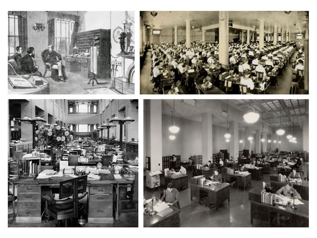
Predicting and creating best practices for future office design requires we look back at the innovations and mistakes of the past. The workplace has undergone many shifts since the beginning of the 20th century and like most things has experienced cyclical design. An exploration into this history gives insights into how we move forward toward success.
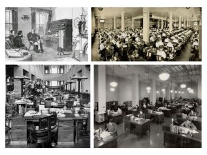
With the rise of larger corporations in the early 1900s came the need for dedicated office buildings like that of the Sears, Roebuck and Co. building in Chicago. The increase in mail order business required one centralized space for employees to process orders. During this time, offices implemented the practice of “Taylorism”, named after Frederick Winslow Taylor, who with Frank and Lillian Gilbreth created the time and motion study. This strategy called for a workplace that reflected a scientific approach to managerial oversight and maximum efficiency and resulted in open bullpens with rows of desks all facing the same direction. It was typical to have the manager’s office on a mezzanine overlooking the bullpens with top level executives on an even higher level. This plan failed to take into account the human or social elements of how people work and would begin to fall out of favor in the mid-century. This style of work also influenced how furniture was designed – a need for a flat-top desk with storage underneath contrary to the top-heavy desks common in offices of the late 1800s.
By the 1960s it was clear that the bullpen was not going to work in a post-war society. A team of researchers for a major furniture manufacturer concluded that a bullpen environment actually reduced communication between employees and created a forced sameness for every individual. Additionally, employee’s bodies were suffering from the long hours of sitting in one place. The research determined that people are most productive when they have both a personalized territory and easy interaction with surrounding colleagues. In response, George Nelson and Robert Propst of Herman Miller came up with a modular furniture system capable of frequent modification to suit the changing needs of an individual employee. The system also featured both sitting and standing “stations” because of the importance of moving positions throughout the day. This product was developed with a human-centric mindset – how to support the needs of the individual and the type of work they are doing. This concept was revolutionary for this time and soon other manufacturers were jumping to replicate it.
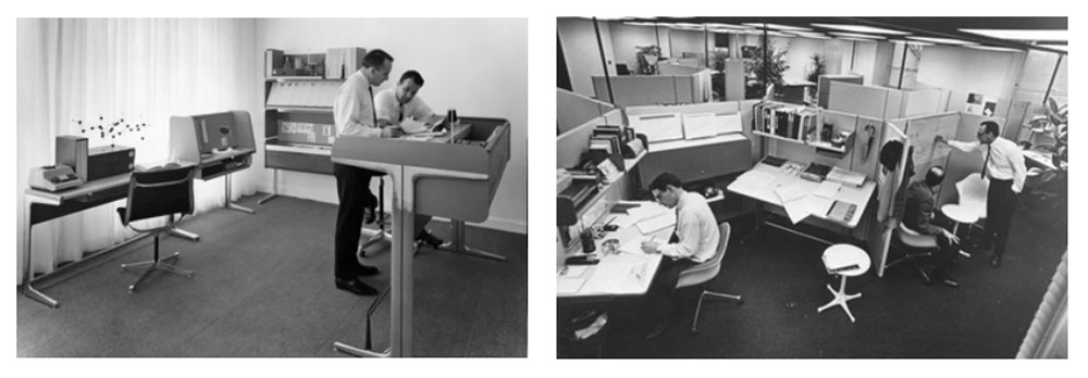
In addition to creating innovative furniture systems, the office space was changing in other ways related to human comfort. Drop ceilings became a standard way to accommodate easy maintenance on air-conditioning as well as sound absorption. Carpeting in offices was not standard in the workplace until the 1950s and also aided in noise mitigation. Overall, the mid-century floorplate design was more egalitarian than its predecessor with an emphasis on traffic flow rather than hierarchy.
In the 1970s performance and efficiency came under scrutiny and the exact furniture system that was designed around human comfort and productivity was corrupted to achieve maximum humans in a minimum space. The flexible and personalized divider system designed for employee wellness was redesigned to be a rigid, monotonous, soul draining cell. – the beginning of a 40-year corporate love affair with the cubicle. Wanting to separate himself from the new design, George Nelson criticized the implementation remarking; “it is admirable for planners looking for ways of cramming in a maximum number of bodies, for “employees” (as against individuals), for “personnel,” corporate zombies, the walking dead, the silent majority. A large market.”
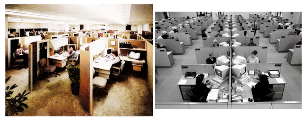
As personal computers found their way from entire rooms to employee’s desk along with cumbersome printers and the need for adequate storage, the cubicle continued to work for the operational bottom line. There wasn’t much emphasis placed on designing spaces for humans as long as the space worked for the emerging and increasingly necessary technology. The .com boom of the 1990s briefly re-introduced bench style seating and more collaborative environments, but cubicles still reigned supreme through the 2000s and in 2002 there was a “cubist revival” at NeoCon with several manufacturers re-working the classic cube for more employee comfort and pleasing aesthetics.
In 2007 the very first smartphone changed so many things including the way in which we worked. By the mid-2010s most organizations provided tablets or laptop computers which un-tethered employees from their desks. Laptops were brought to meetings instead of a notepad and pen and there needed to be ways to share an individual screen with an entire conference room. Desktops perpetuated the way cubicles had been designed for decades and as technology became mobile, the needs of the workspace changed significantly. Lower partitions (or no partitions) became favored, less space dedicated to workstations and more space dedicated to conference rooms or collaborative space with integrated technology.
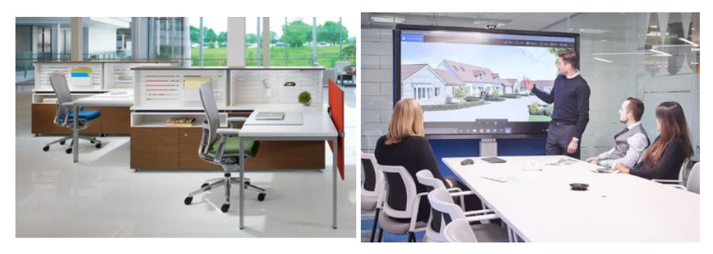
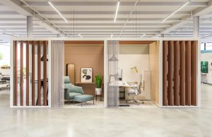
In 2020 as we began a new decade, a global pandemic ushered in a massive paradigm shift and everything we knew or know about the workplace was questioned. It was the perfect opportunity to look back on the mid-century idea of designing the workspace for humans and not technology. Workplace planners like POE and our partner, Haworth, took a holistic approach to designs based on the type of work being performed and the culture of the organization leading to successful hybrid approaches with human-centric offices that people want to come work in!
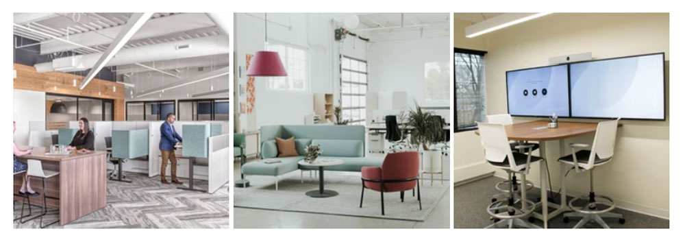
Two years later as most organizations have begun to make decisions about their workforce and real estate, the bottom line is still a concern. Leaders see the value in a remote or hybrid workforce being able to scale back the real estate bill. In addition to this, there is a new demand for video conferencing with many employees working remote. Conference rooms are being redesigned for camera and microphone placement to give remote employees as much access as possible to their in-office counterparts. As designers, we must be careful not to repeat the mistakes of the past and fall into designing a workspace to accommodate technology over the humans using it. As technological progress chugs full steam ahead, we would be best to embrace it, but not lose sight again of what good comes from designing human-centered workspaces.

