Portfolio
We design interior spaces for corporate offices, educational communities and health systems with an emphasis on furniture.
Work
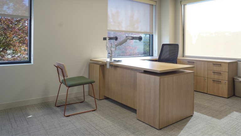
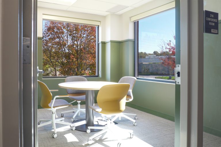
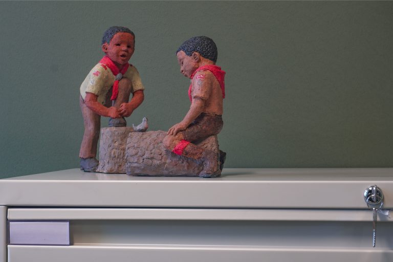
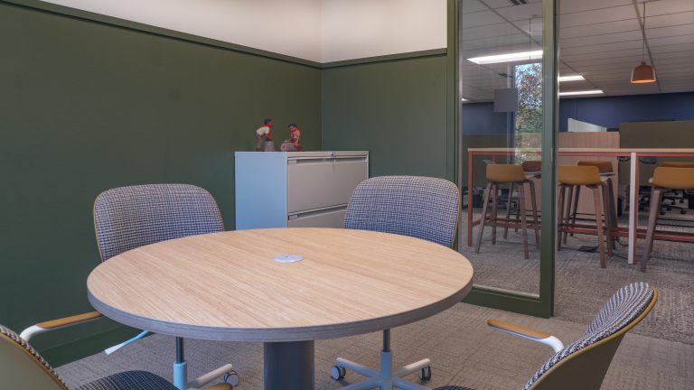
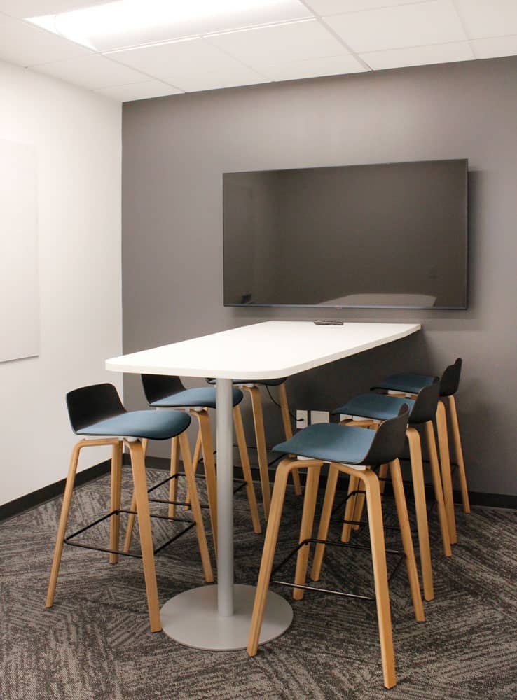
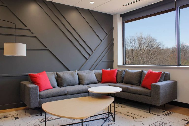
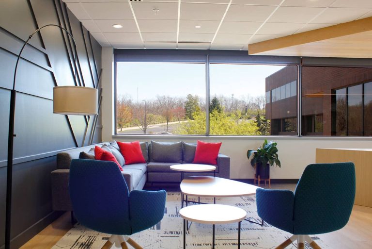
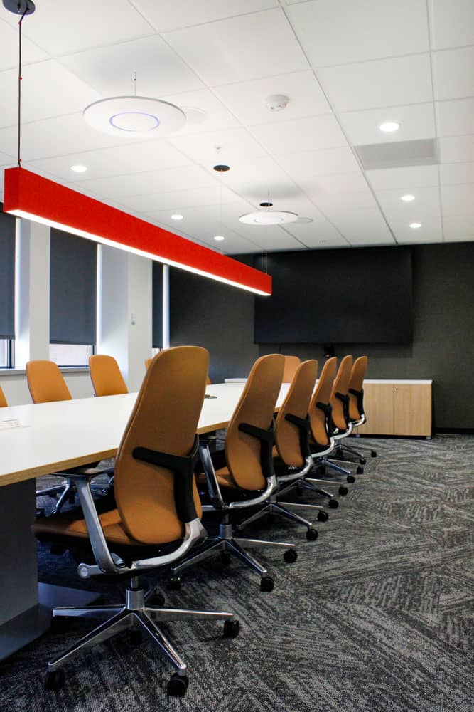


We design interior spaces for corporate offices, educational communities and health systems with an emphasis on furniture.
Consumer Goods (Cereal and Pet Food) – Lakeville, MN
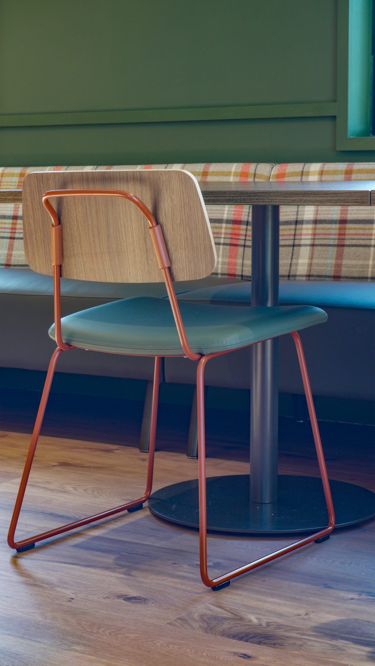
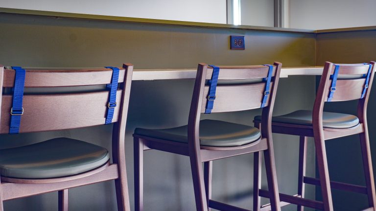
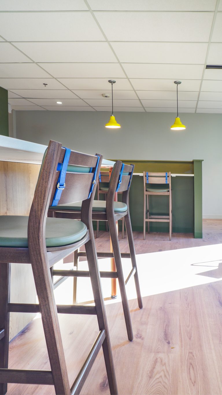
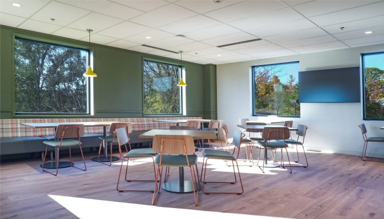
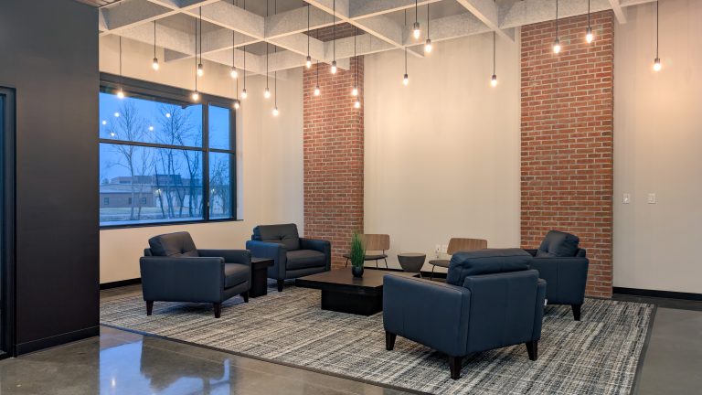
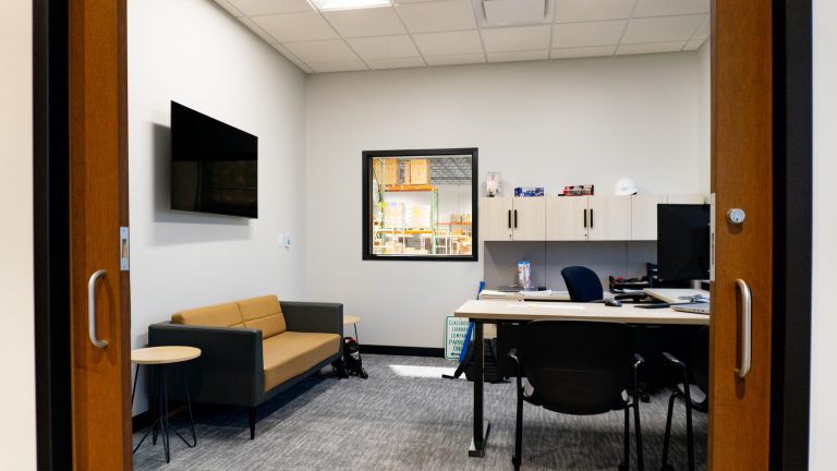
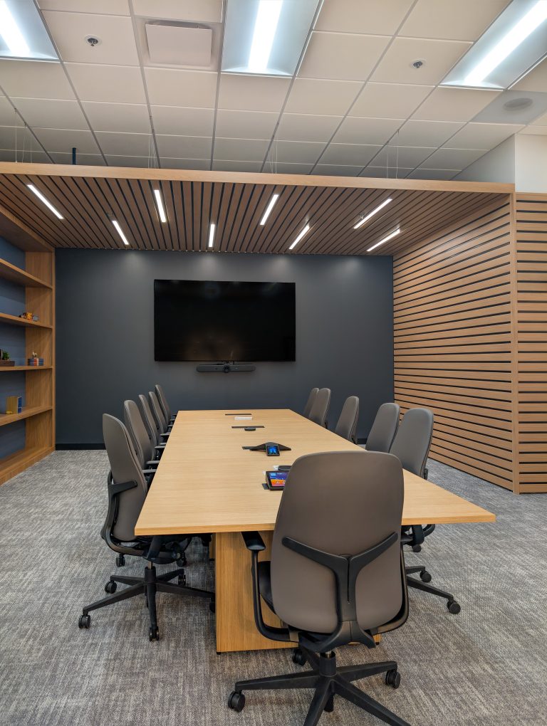
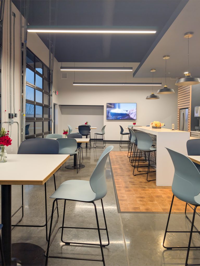
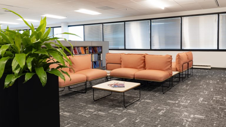
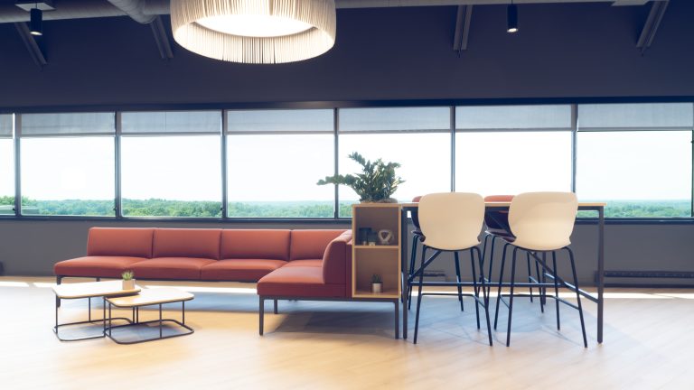
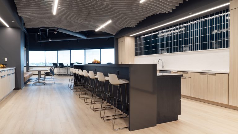
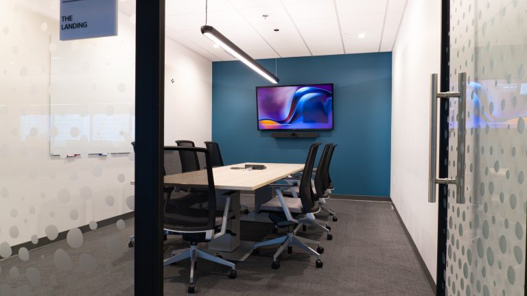
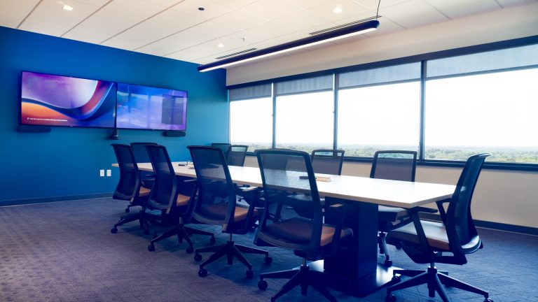
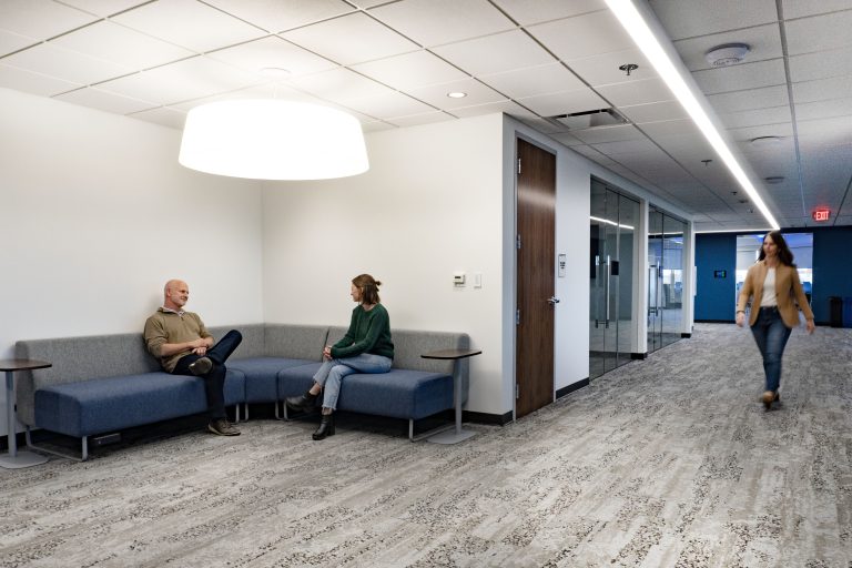
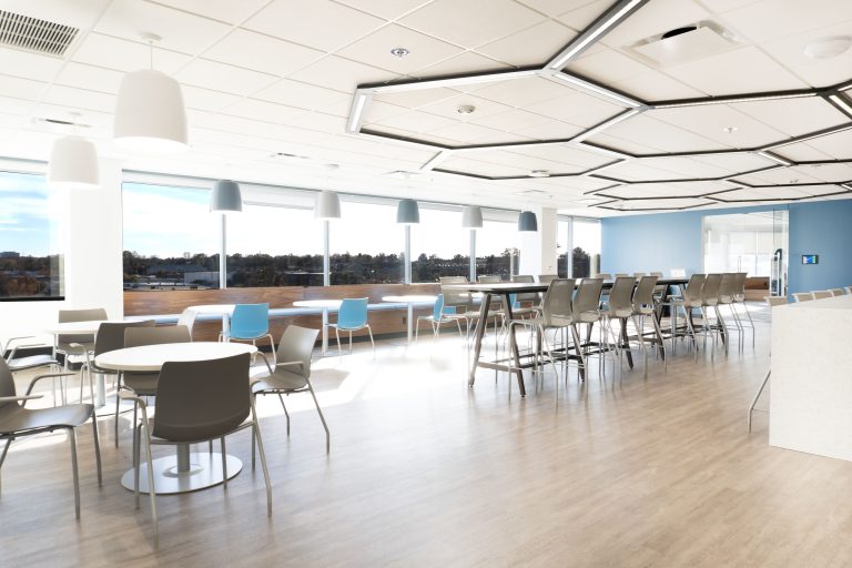
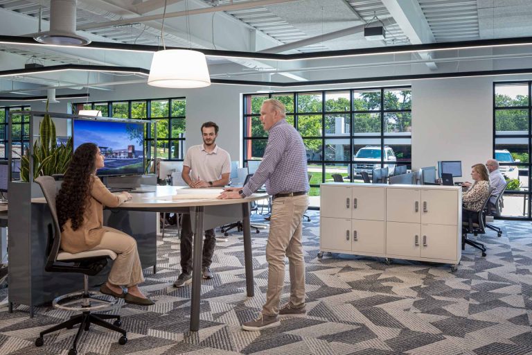
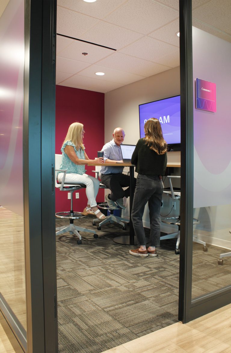
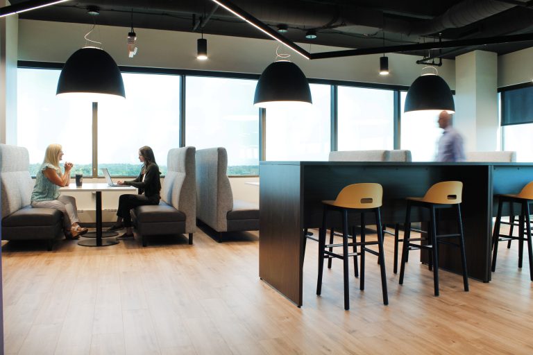
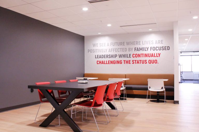
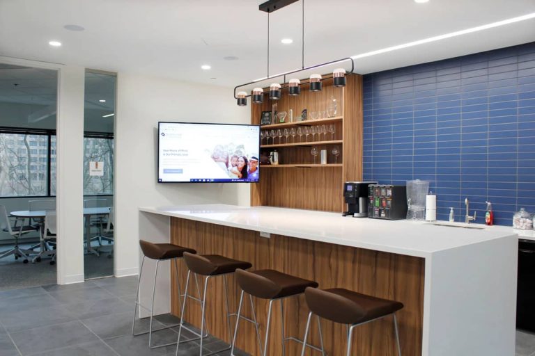
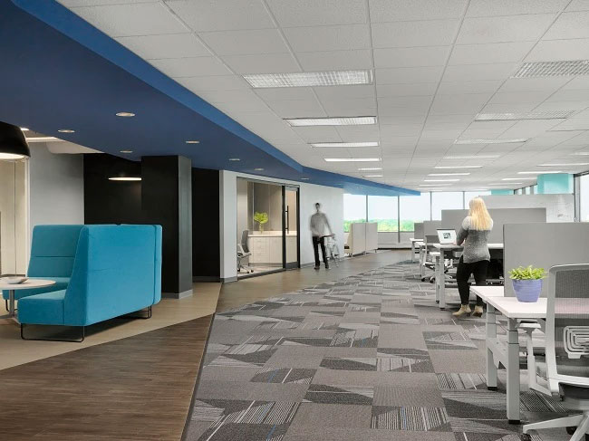
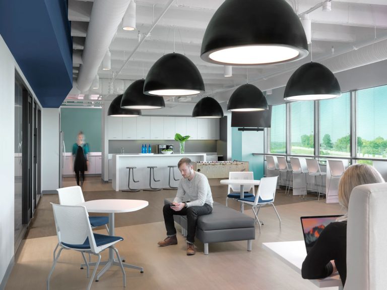
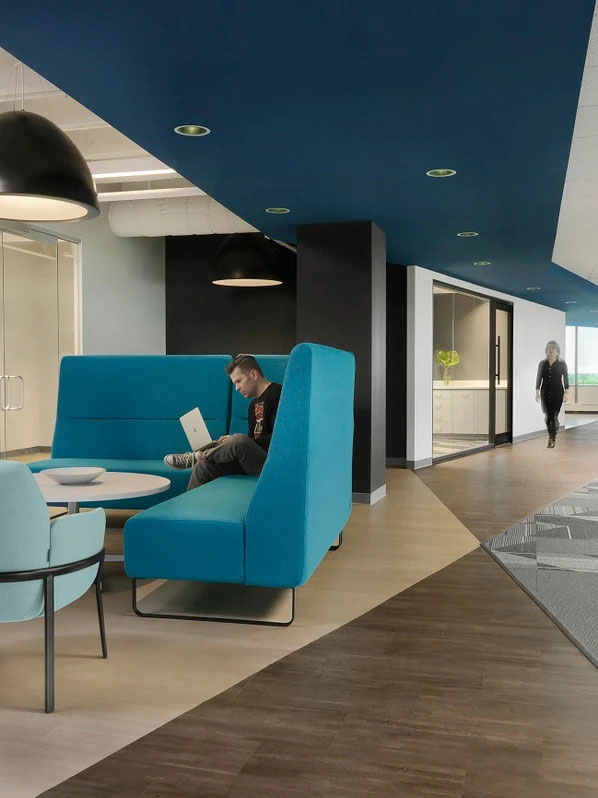
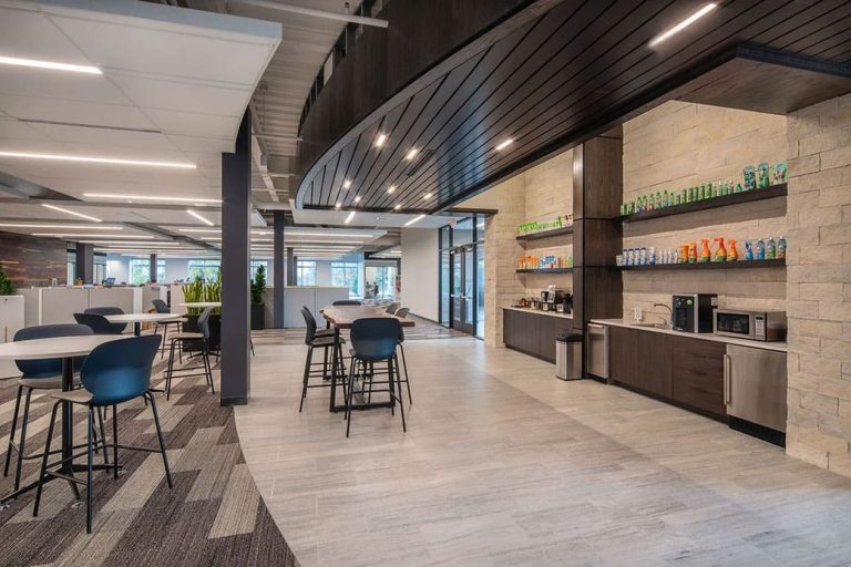
Post Holdings in Lakeville, MN was rebranding– changing their colors and values – which became a perfect opportunity for a grassroots effort by the Marketing and Human Resources Departments to refresh their workspace. The 8+ year partnership between P·O·E and Post yielded the trust and familiarity needed to embark on this large project. After a Discovery session with the team leading the Post workspace transformation, it was determined that both the east and west buildings would need an equitable update. Neutral furnishings that feel cozy and homey make employees feel comfortable and welcomed, while supporting any brand changes in the future. Since the workforce was invited to come back into the office 3 days per week, a communal space was needed to drive frequent and quality interactions among employees.
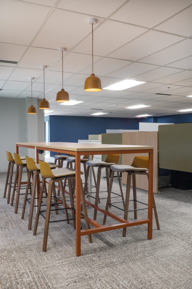
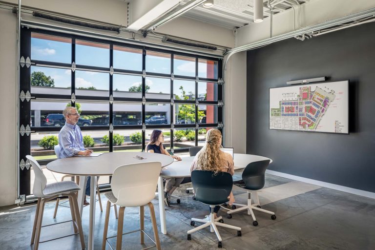
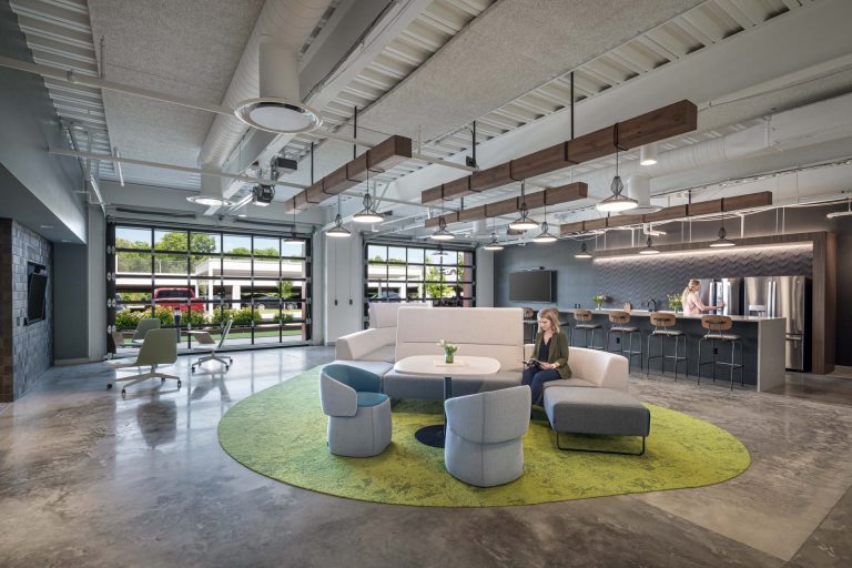
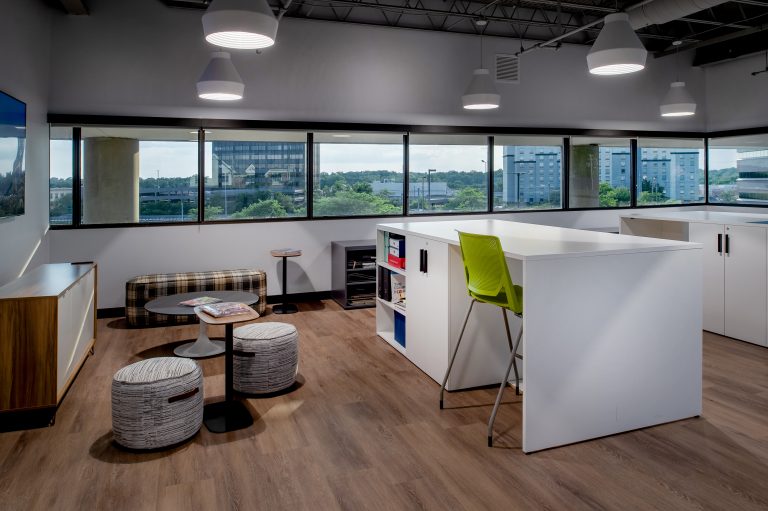
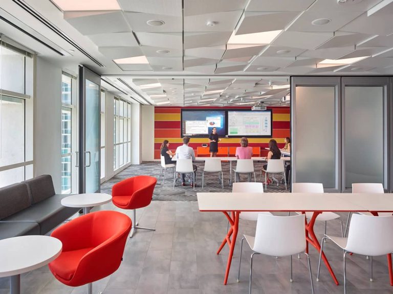
A former bullpen of workstations was reimagined into a flexible project room, “The Loft.” The space was redesigned for agility, comfort, and brainstorming with sliding acoustical screens, whiteboards, movable furniture, and a mix of seating types and postures.
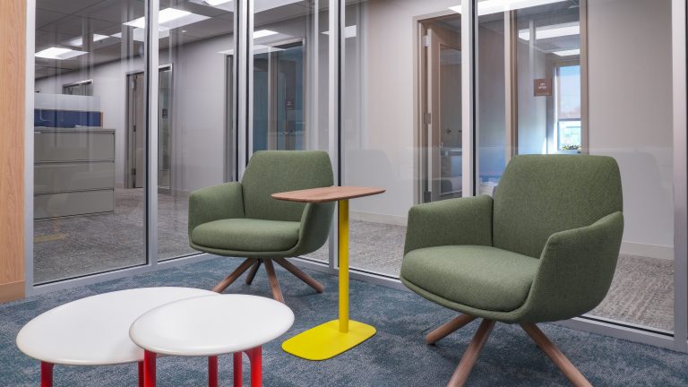
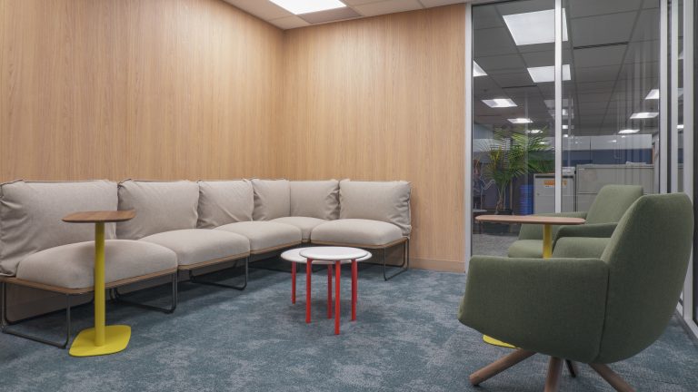
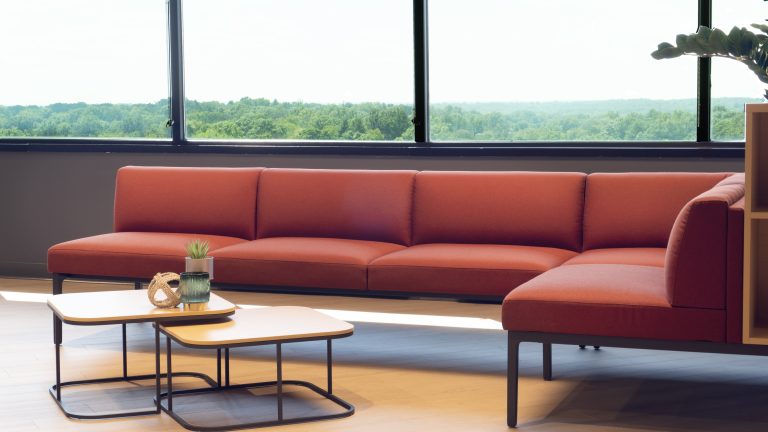
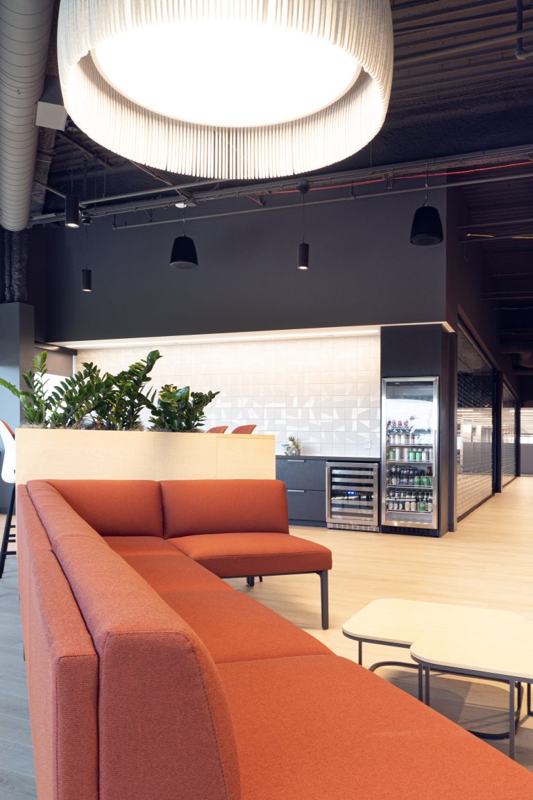
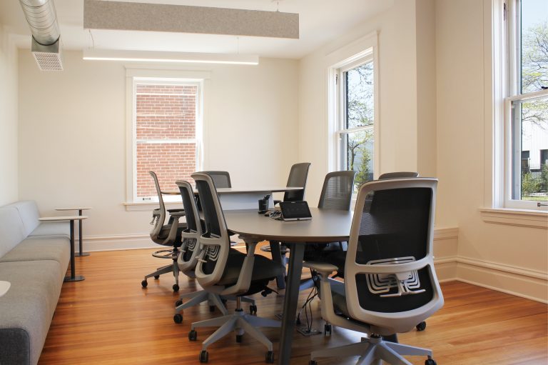
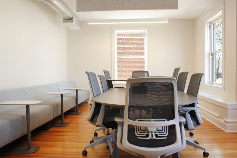
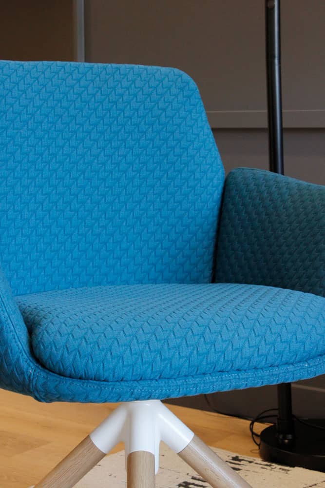
Haworth Maari seating was used in its many iterations throughout this space, creating consistency in aesthetic and finishes, while meeting different functionalities within each space.
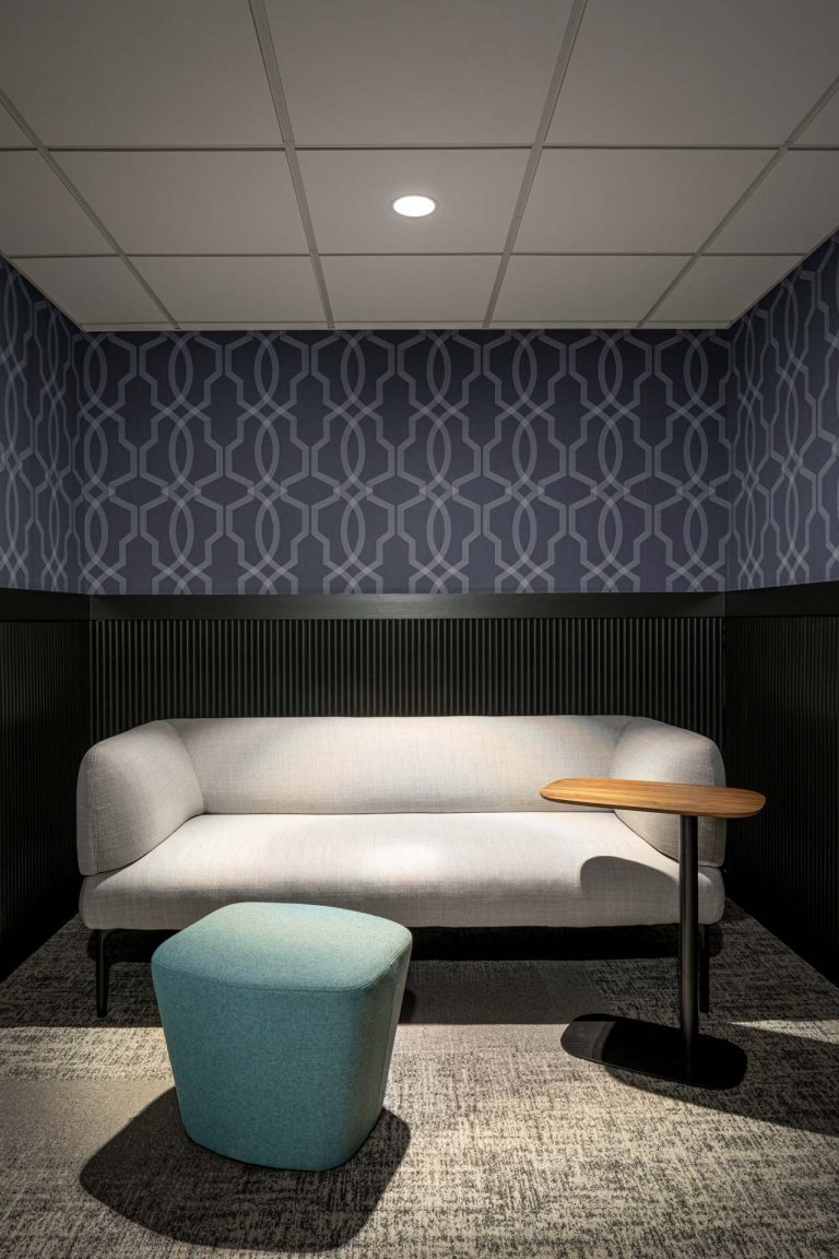
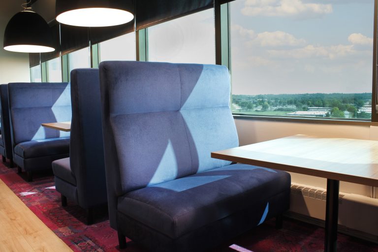
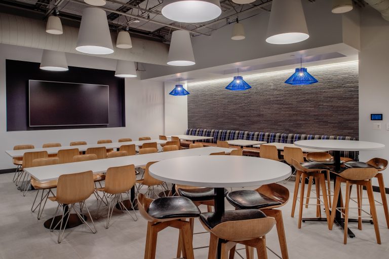
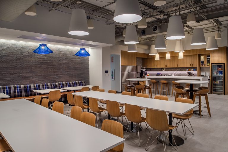
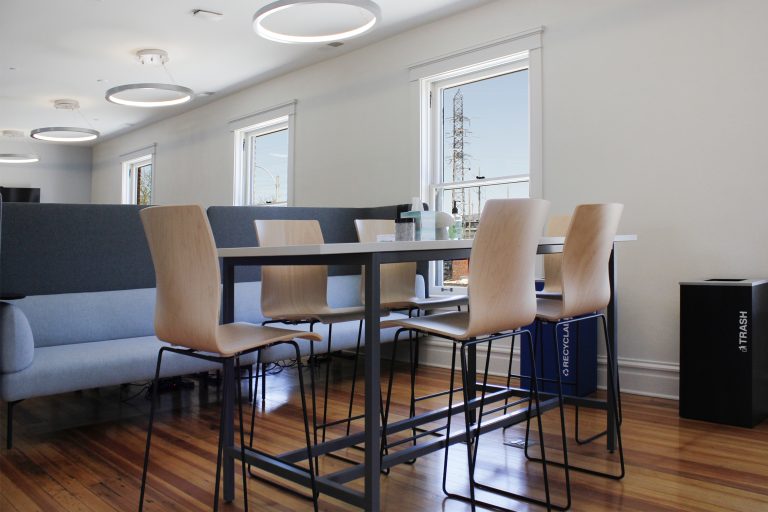
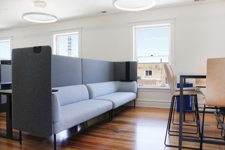
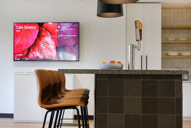
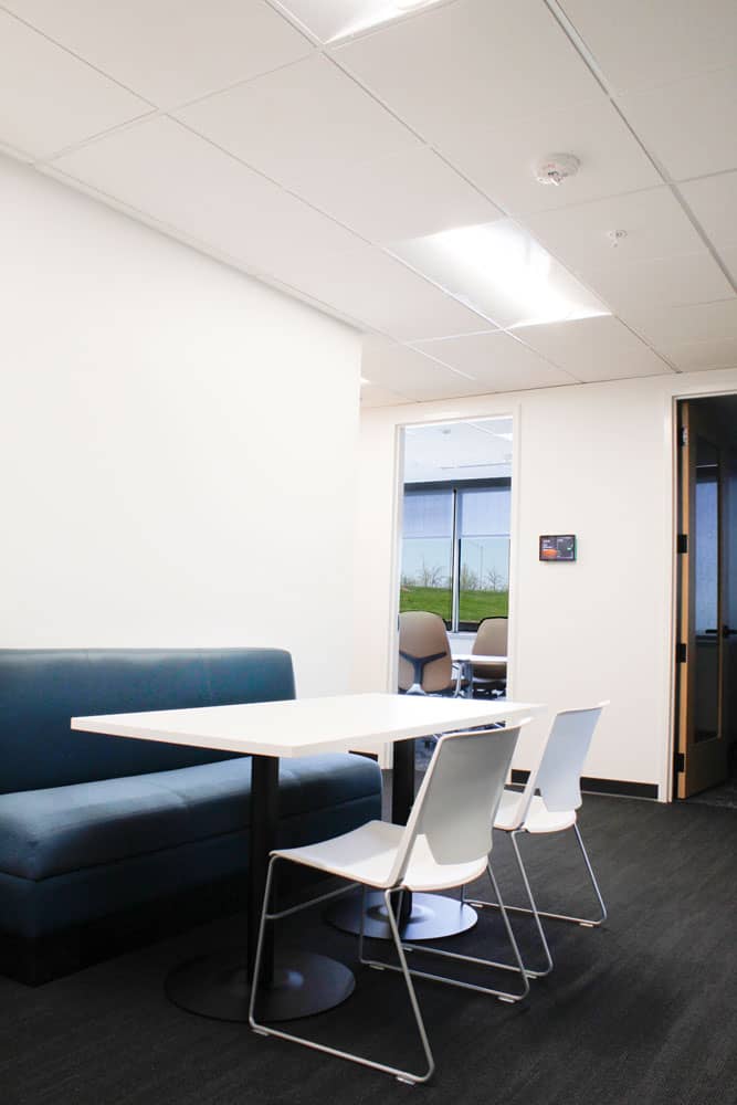
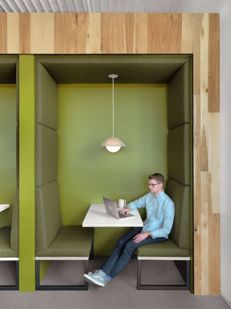
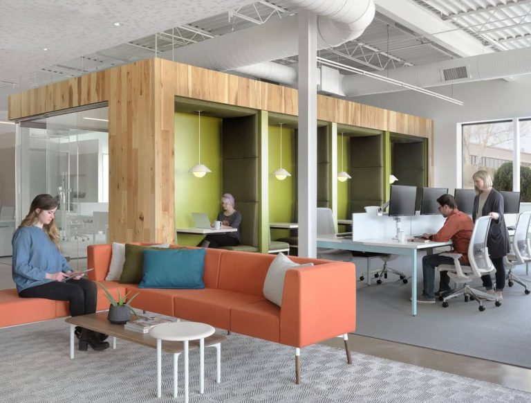
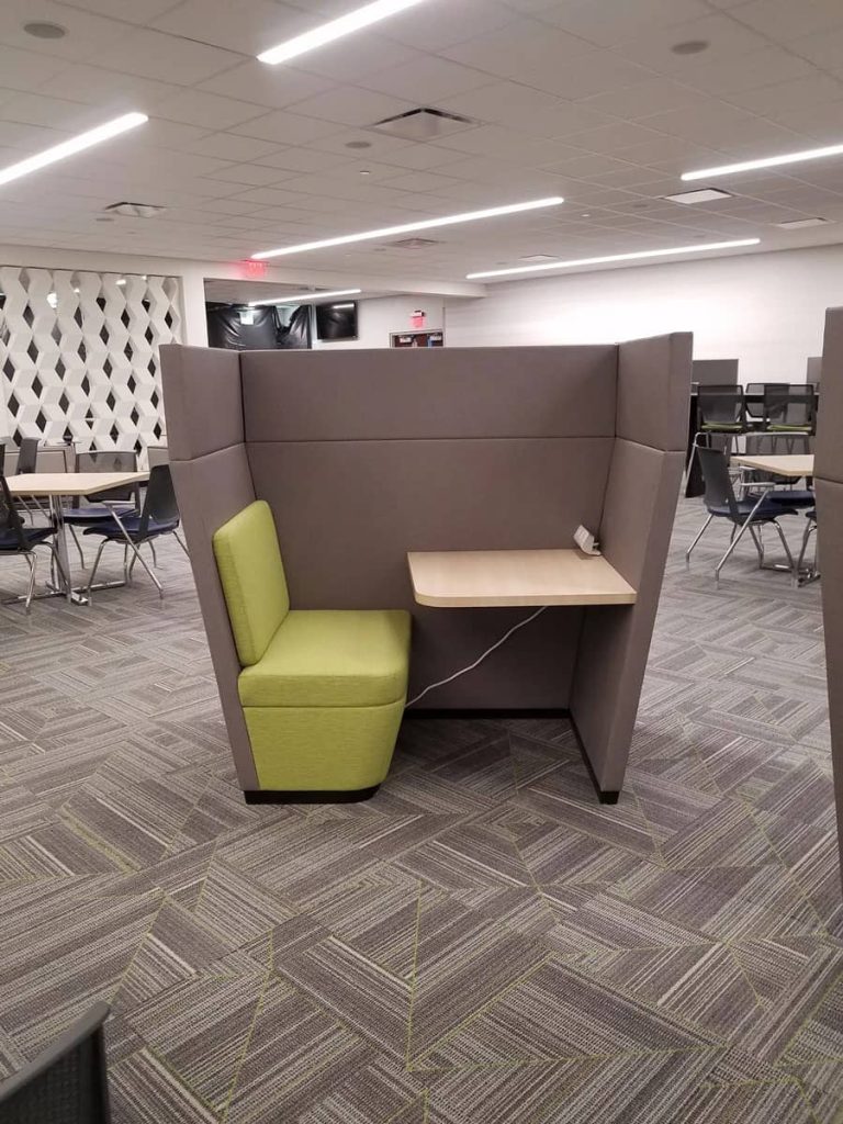
Haworth Cabana with high screens provides a sense of privacy and is the most used piece of furniture in the renovated lunchroom.
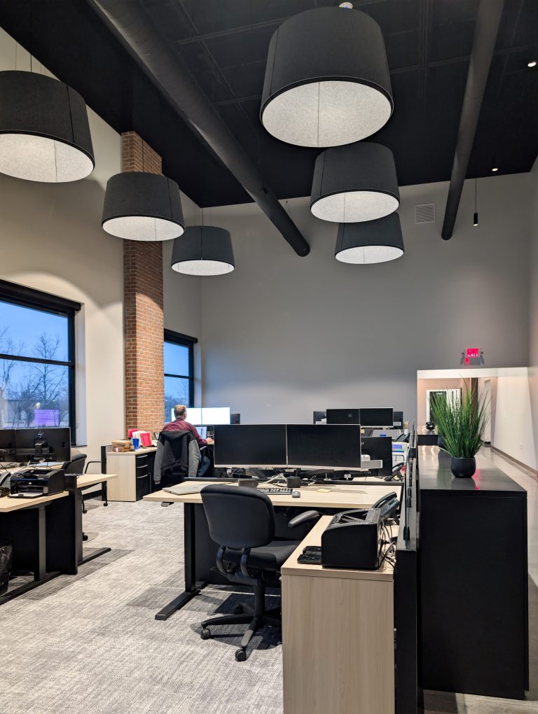
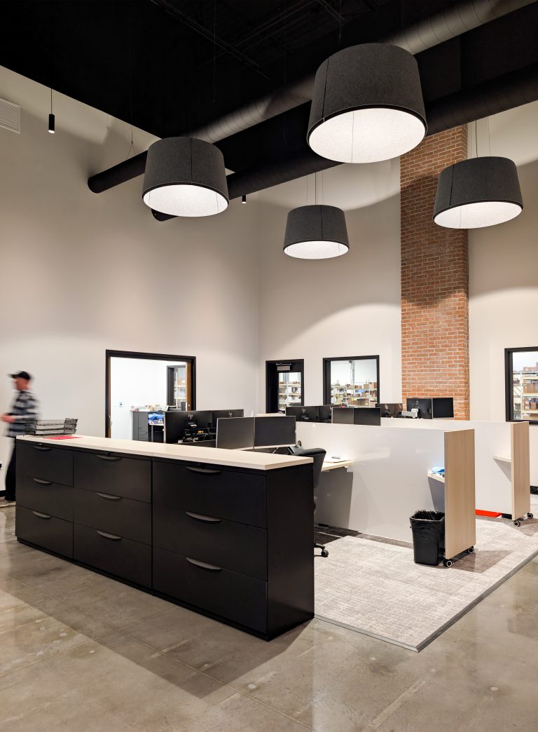
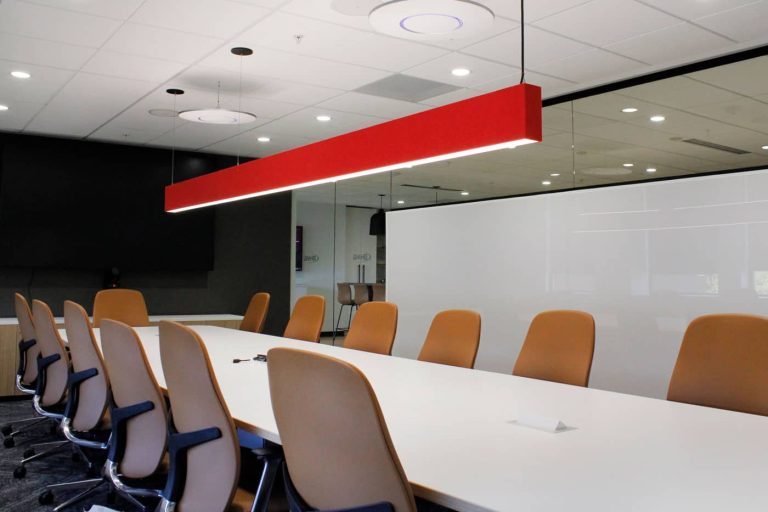
Buzzi light fixtures not only provide acoustic solutions but also a beautiful focal point to anchor a space.
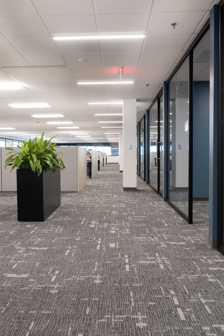
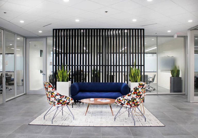
OFS planters add privacy and space definition while bringing the outside in. Employees state that having added greenery has made a big difference in their mood and is being incorporated into other work areas throughout campus.
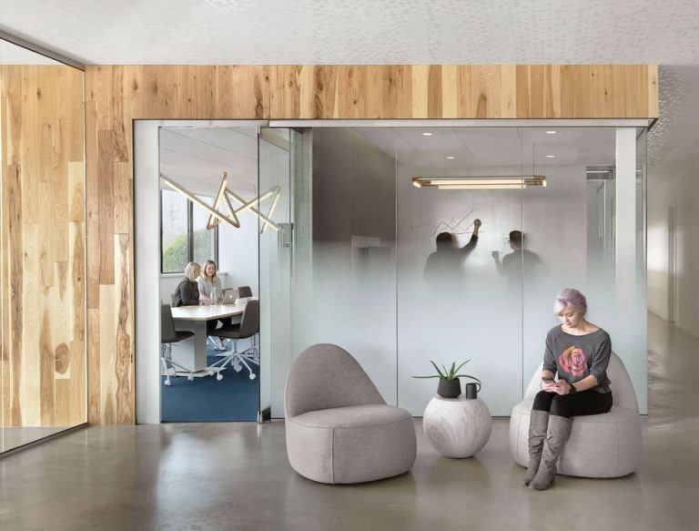
Haworth Pergola was installed as a space divider and semi-private meeting space incorporated between the work café and the main corridor. Pergola is a perfect example of a flexible architectural interior as it can be changed frequently to accommodate how employees are currently working based on its modular design, integrated palette, and variety of accessories and configurability.
Whether employees are hybrid or back in the office full-time, the way the workforce uses the office has evolved. Creating a space with purpose and strategy will ultimately benefit employees and leadership alike.
Town and Country, MO | Corporate office
The Boy Scouts of America was moving into a new building and revamping the way they work. Their new building in Town and Country, MO was completely redone with a partnership between Holland Construction, Arcturis, and P·O·E.
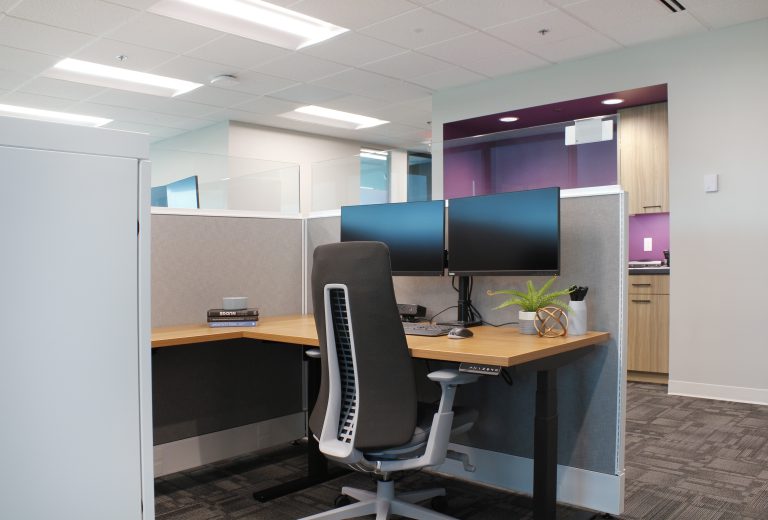
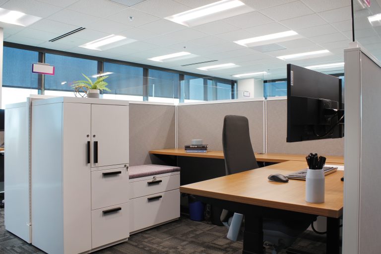
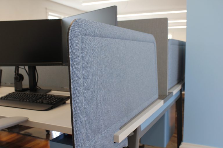
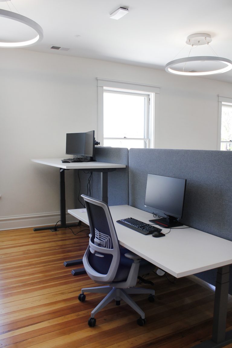
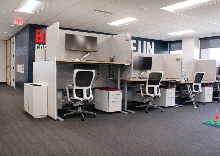
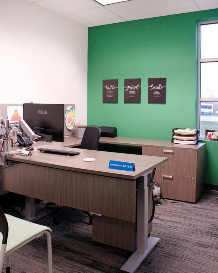
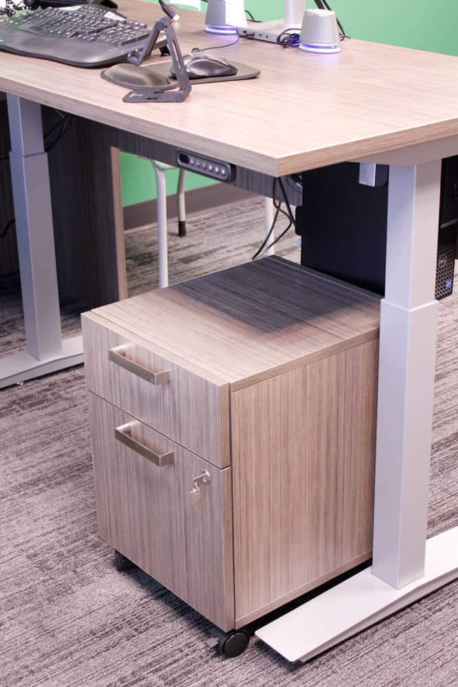
The St. Louis Boy Scouts Team was in traditional full-height cubicles with stationary desks, and they wanted this new building to encourage different postures with height-adjustable desks and a variety of collaboration spaces. The design was inspired by the outdoors, featuring colors and textures that evoke a sense of being about to embark on a camping trip. Great attention to detail was paid to the furniture choices, respecting the timeline and budget while supporting the playfulness of the design vision.
This new space will support the variety of ways that people do their best work and surround them with a design that inspires their mission.
Alton, IL | Coworking Space
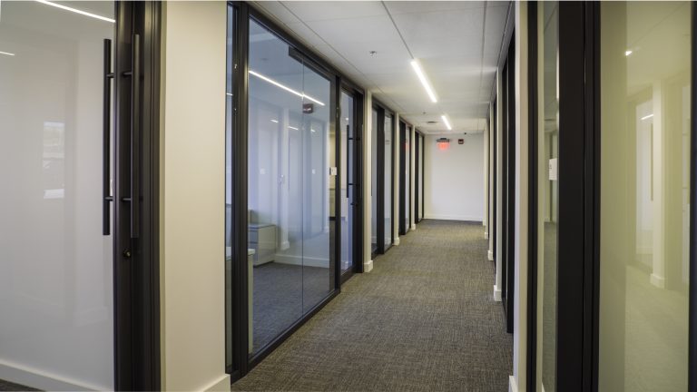
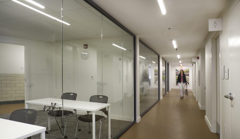
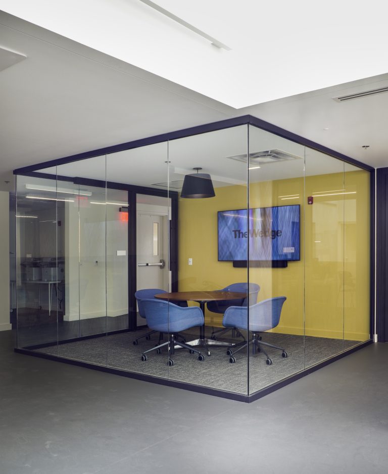
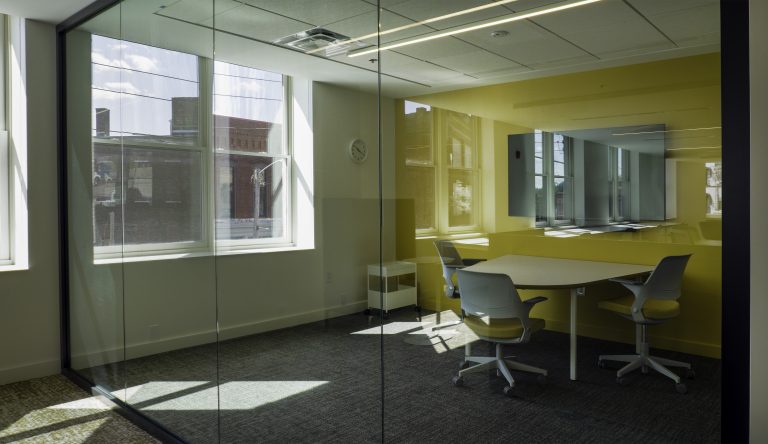
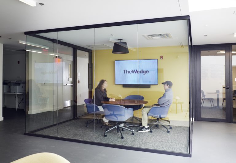
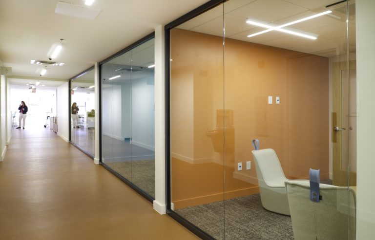
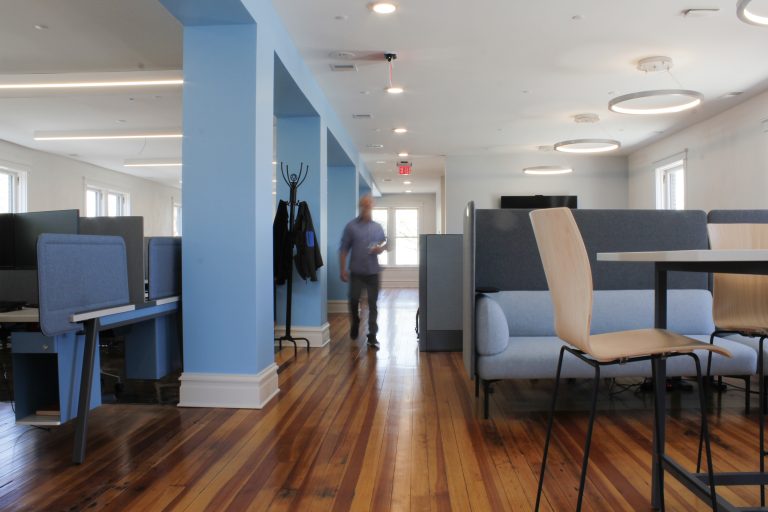
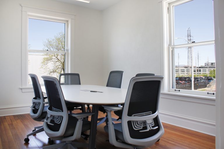
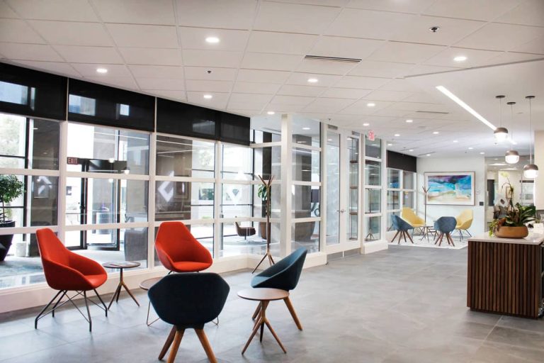
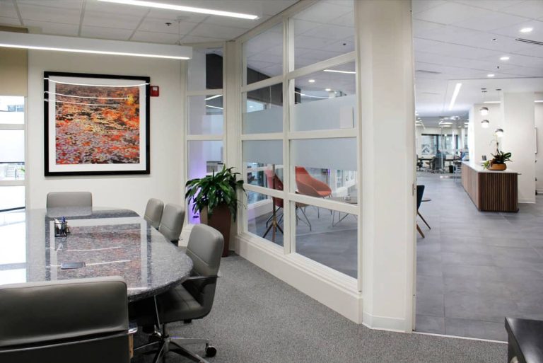
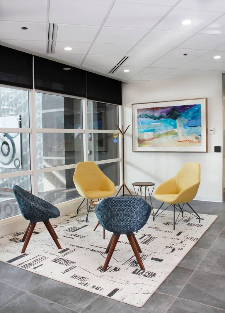
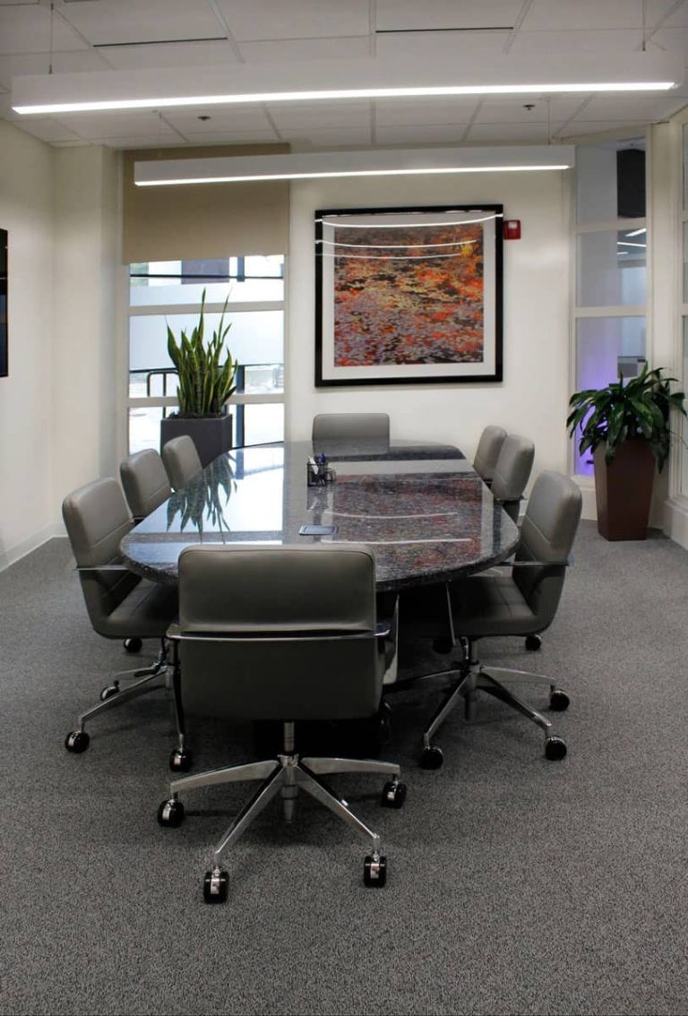
This historic Building located at 620 E. Broadway in Alton, Il was constructed at the turn of the 20th century. BSI has done an amazing job rehabilitating the space, keeping several original features. P•O•E won the bid to provide glass walls for the offices, conference and training rooms. Product: Fellows Volo frameless demountable wall systems. Architect: Melissa Harlan of Kiku Obata.
St. Louis, MO
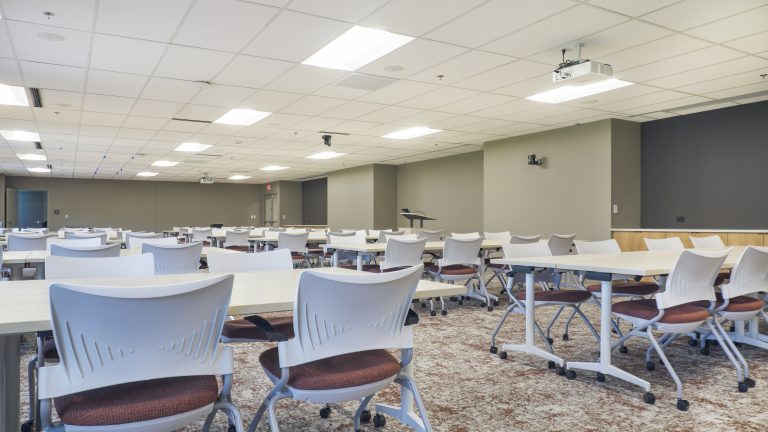
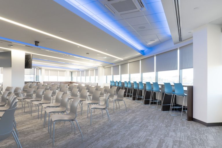
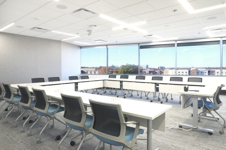
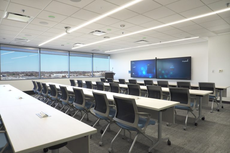
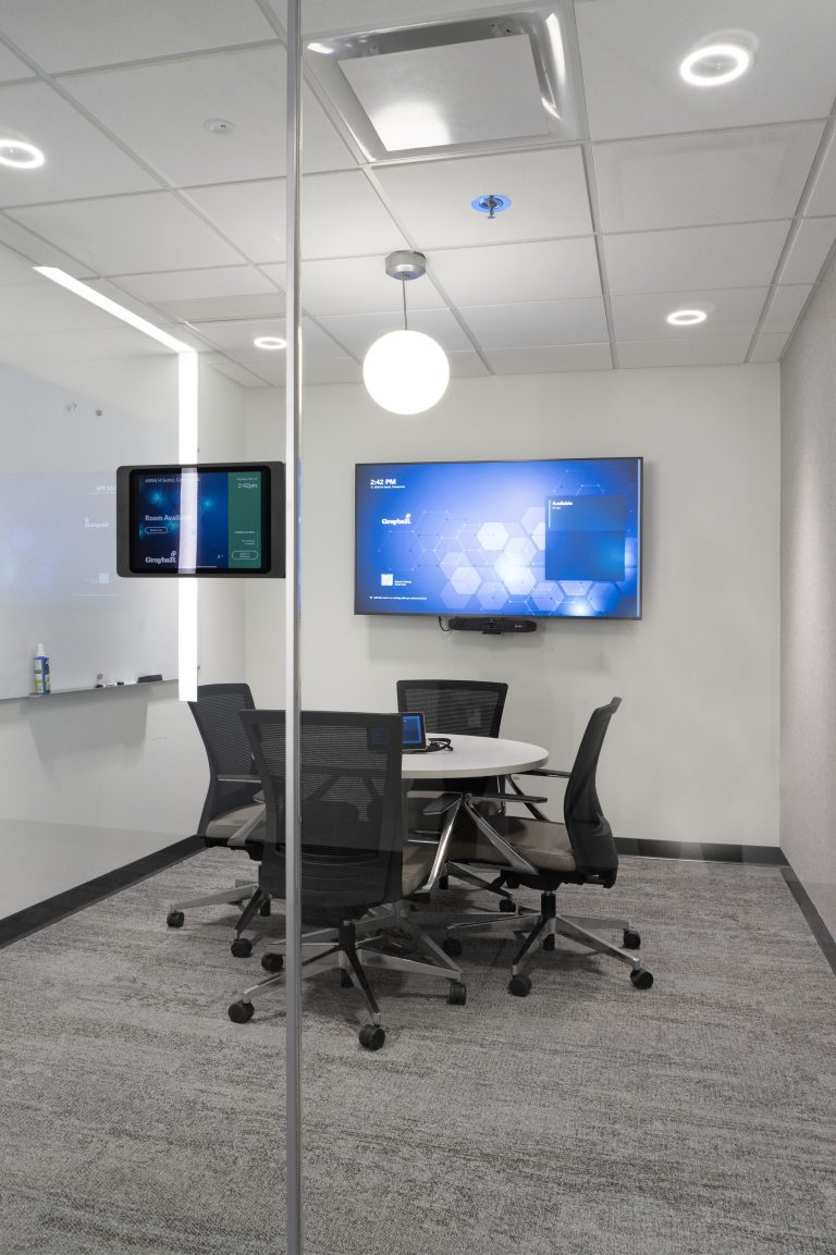
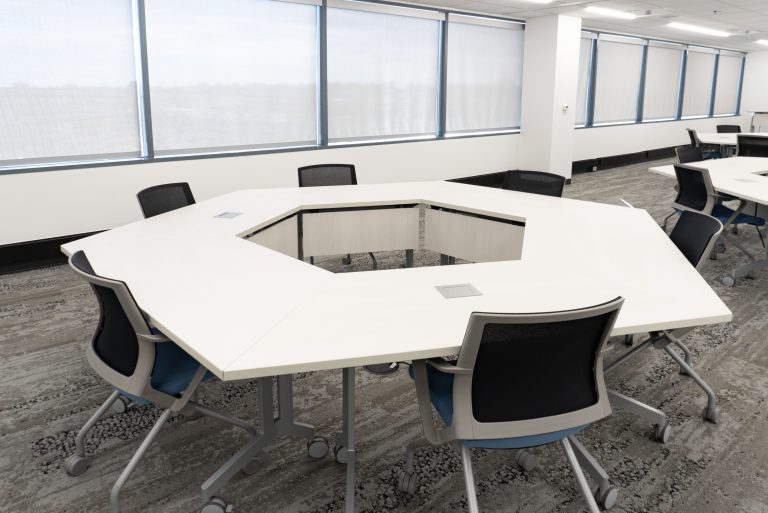
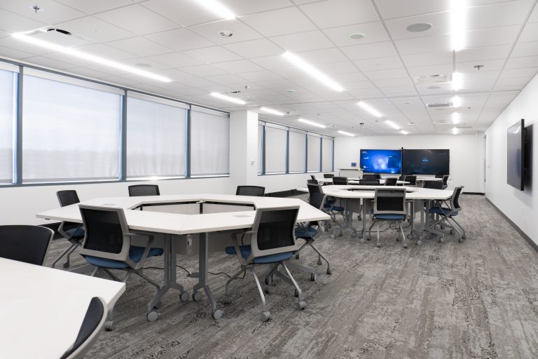
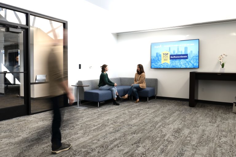
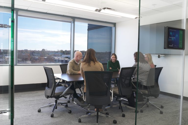
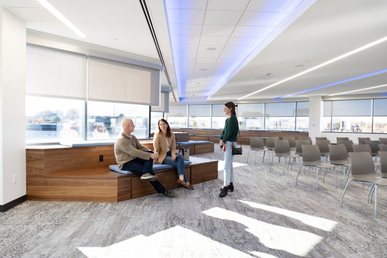
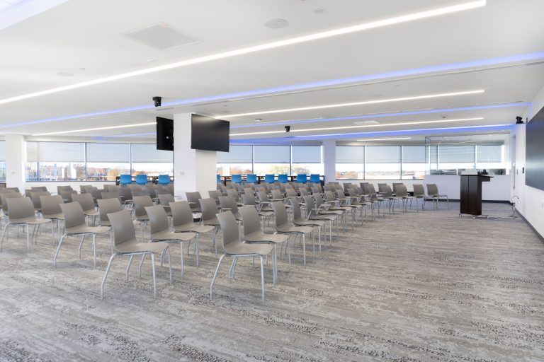
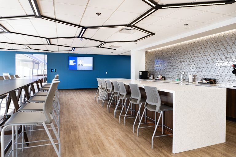
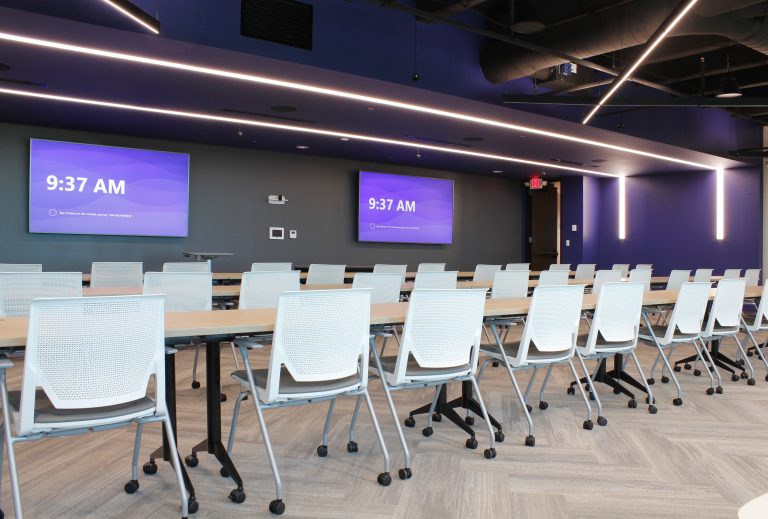
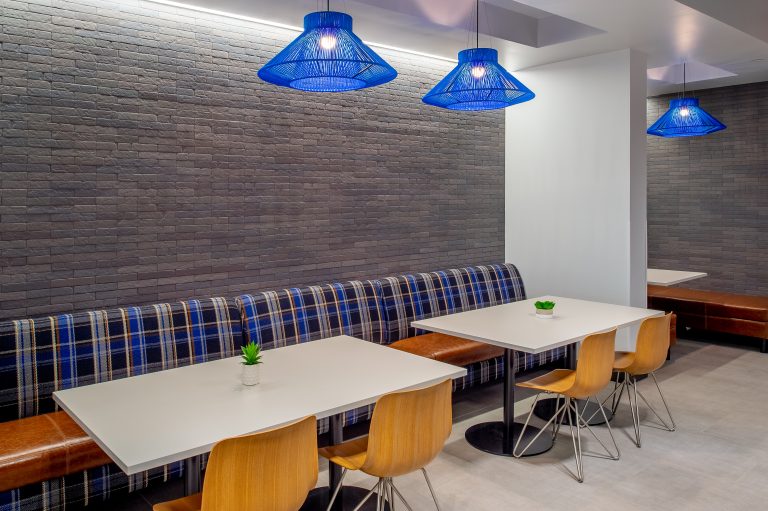
A flexible environment that supports a variety of work styles is important to Graybar and is reflected in the furniture that P·O·E chose for the space. A lot of care and thought went into how the mobile trapezoid tables could function and be reconfigured to support the different work that would be done in the large multipurpose room. The entire space has a neutral look without feeling cold or austere. The designers introduced pops of “Graybar Blue” in the furniture which creates visual interest and supports the branding. The space is being used often because of the functionality and comfort this renovated workspace provides.
St. Louis, MO
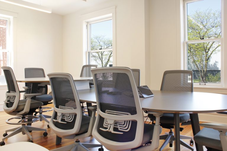
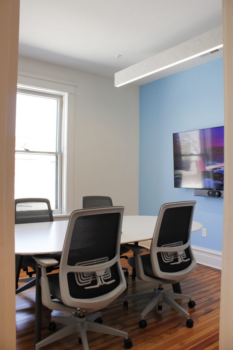
P·O·E was chosen as the furniture design/product selection partner on BSA’s new office project. Based on the vision that BSA had for their new space, our designers chose Pair workstations with planters and collaboration tables. Haworth Immerse tables with several versions of the Maari chair are also placed throughout the workspace. Half the workstations are unassigned seating, so Allermuir lockers were utilized in those locations for ease of storing personal belongings. BSA’s new office is unique in the fact that there are no private offices. The whole vibe of the office is of inclusion and collaboration. Even the welcome desk is set behind the lobby seating so guests feel comfortable and included before they are even greeted. The executives sit out in the open at one of the Haworth Immerse tables to create a sense of equity and teamwork. It is a beautiful and functional space for this healthcare architecture firm and P·O·E is proud to have been their chosen partner.
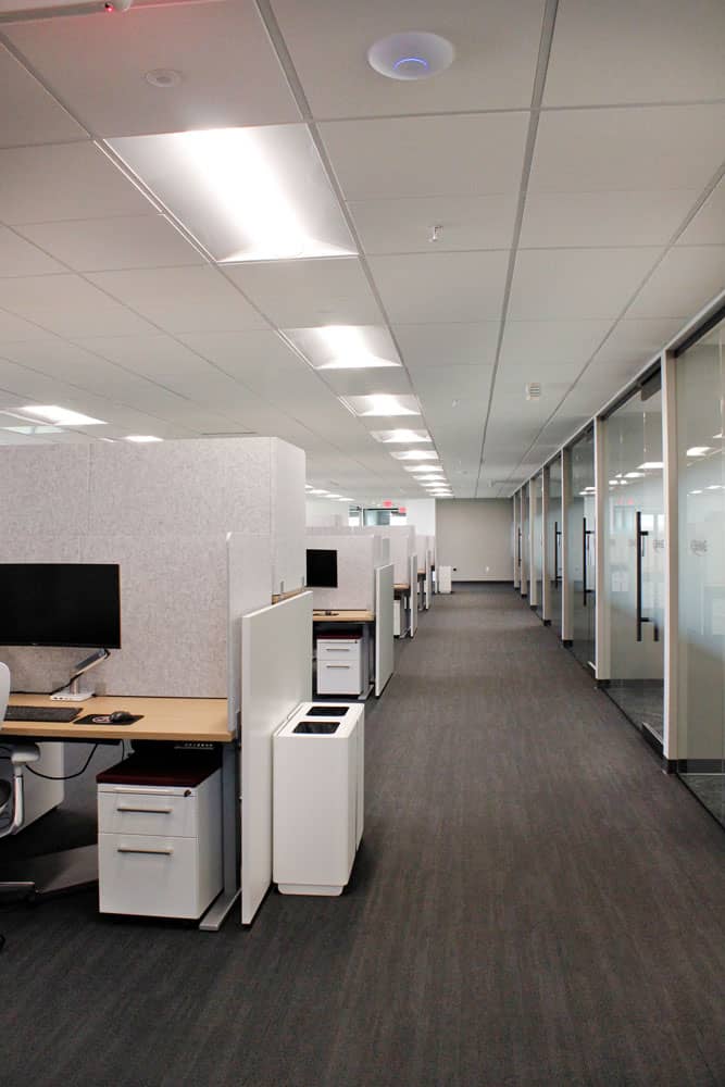
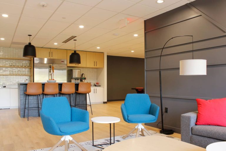
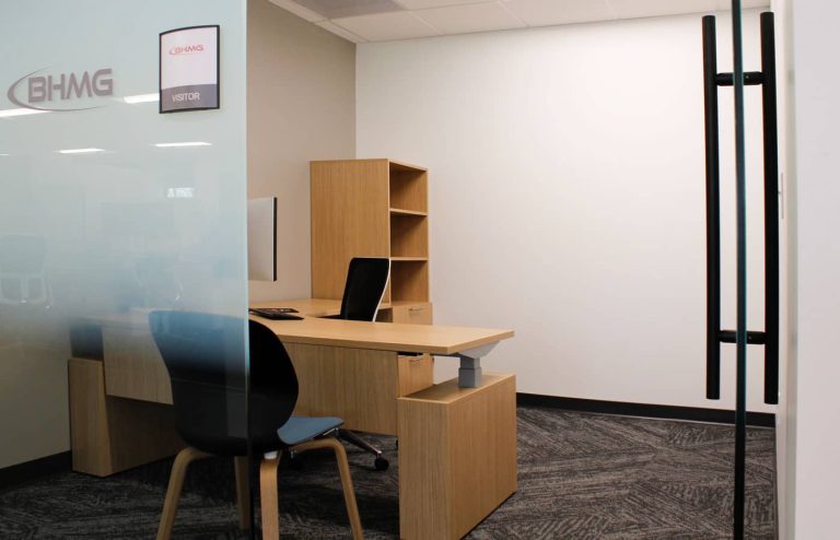
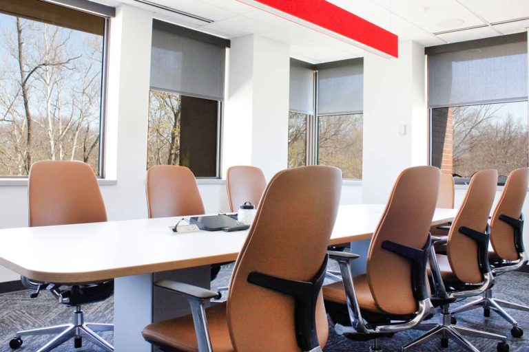
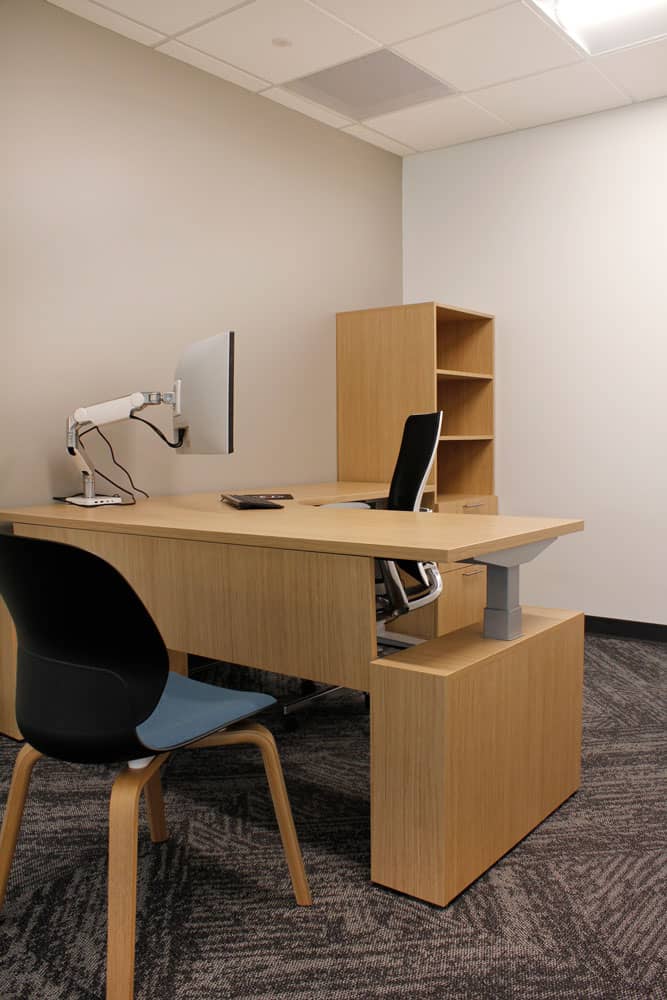
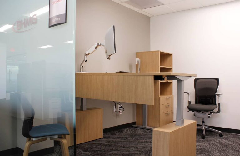
With the next generation of leadership at the helm, BHMG knew they needed to get out of their funeral home-turned offices and into a fresh and cool space that would attract new talent. The utility engineering firm was passionate about the overall “look” of the space, but more importantly, giving their employees the gift of ergonomic seating. BHMG was one of the first organizations to implement the Haworth Zody II and Zody LX into their offices. These chairs have “dual postures” so the user can sit normally, or “perch” while doing their work or sitting in a meeting. The new space has windows lining the entire perimeter and for everyone to benefit from the natural light and have a view of the trees outside, the private offices are in the interior of the floorplan with glass fronts while the bullpen workstations are adjacent to the windows. The original plan was for “L” shaped workstations, but at the very last moment after all the plans were finalized, a change was made to bench-style workstations and P•O•E was able to make the change quickly with no delay to the order. P•O•E worked alongside Eddy Design Group to make BHMG’s vision come to life and they now have a really cool workplace to call home.
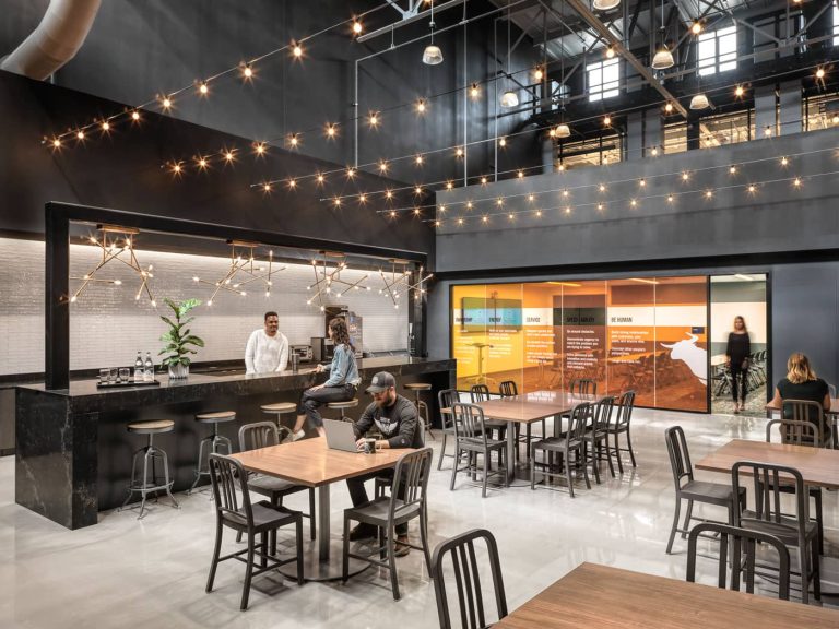
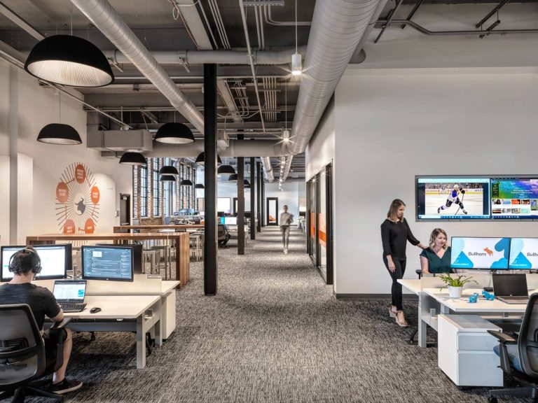
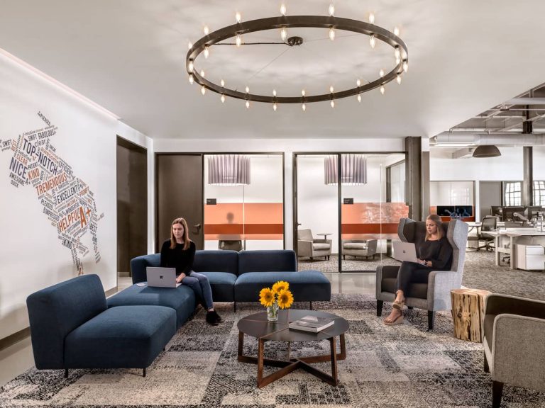
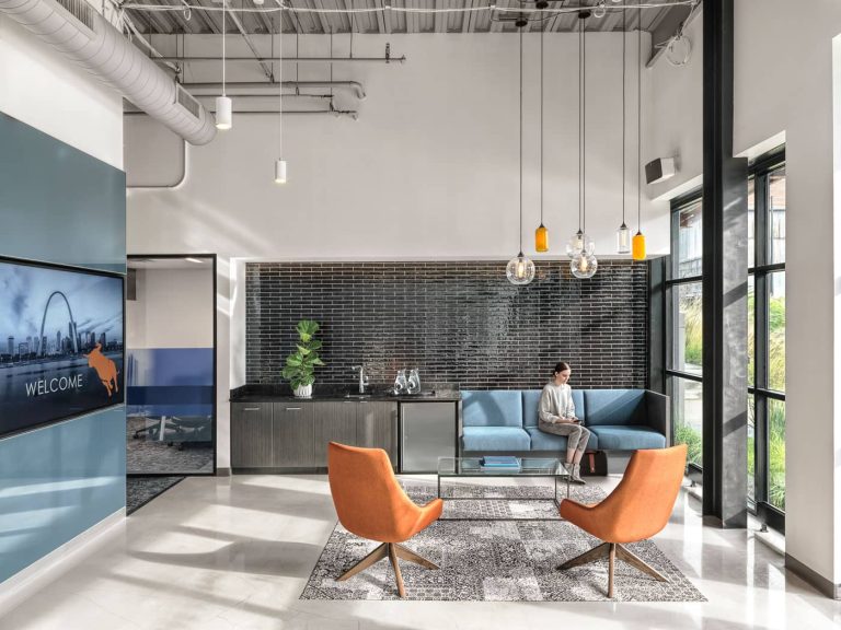
Bullhorn wanted a space that incorporated its brand and aesthetic intermixed with the industrial bones of City Foundry in St. Louis. The new space is able to house around 110 employees with only 3 dedicated offices. Their planning strategy involved three neighborhood pods separated by the floating conference room and phone booth structures that act as billboards showcasing ribbons of built-in media screens with live content.
They utilized benching systems for their workstation setup with a multi-monitor setup and height adjustment worksurfaces. The enclosed conference rooms and offices sit toward the core to allow maximum daylight. The cafe sports a great two-story volume with decorative lighting. The branding and essence of the Bullhorn employee experience are punctuated with large environmental graphic installations throughout the space.
Design Firm Credit: Lawrence Group
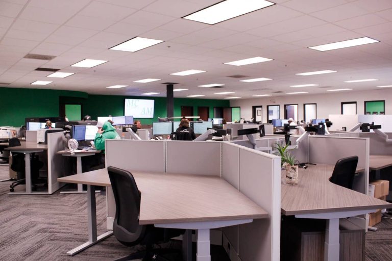
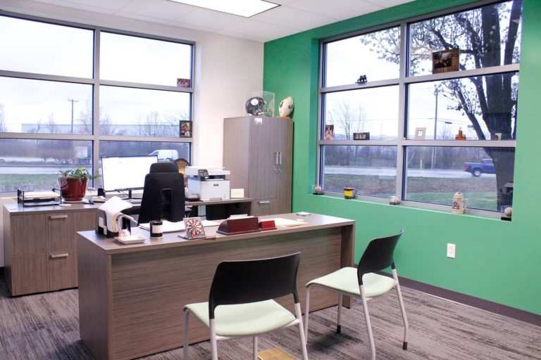
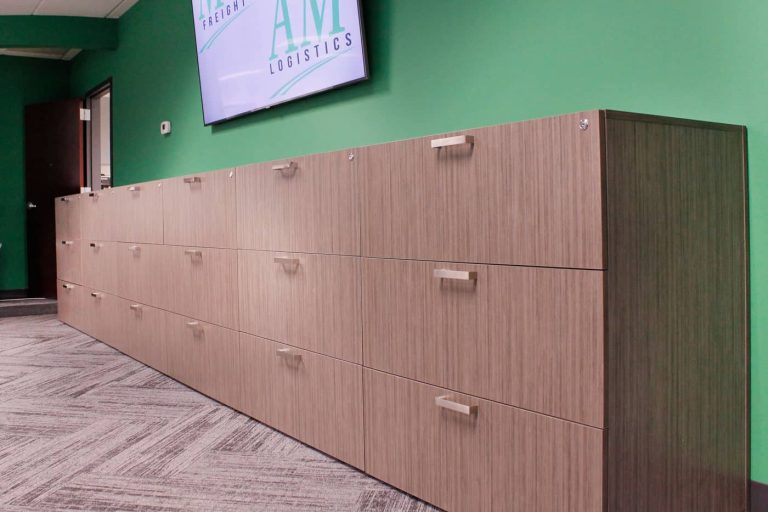
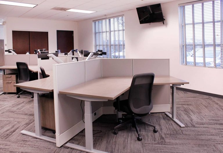
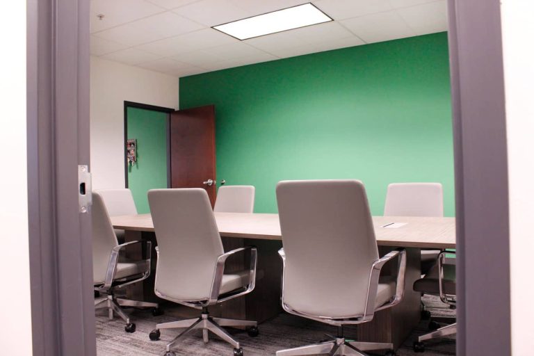
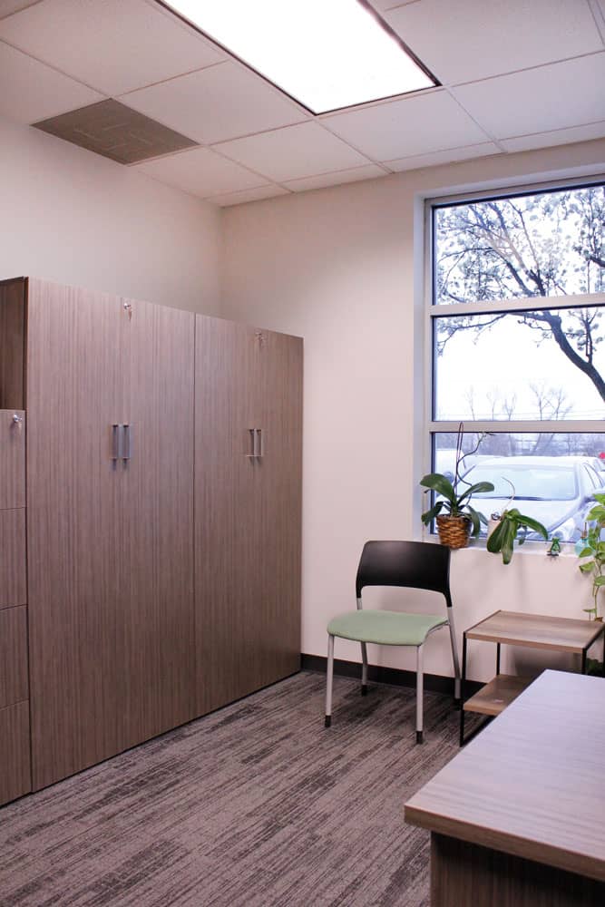
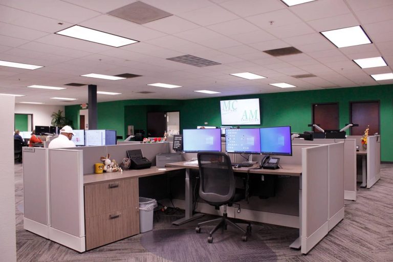
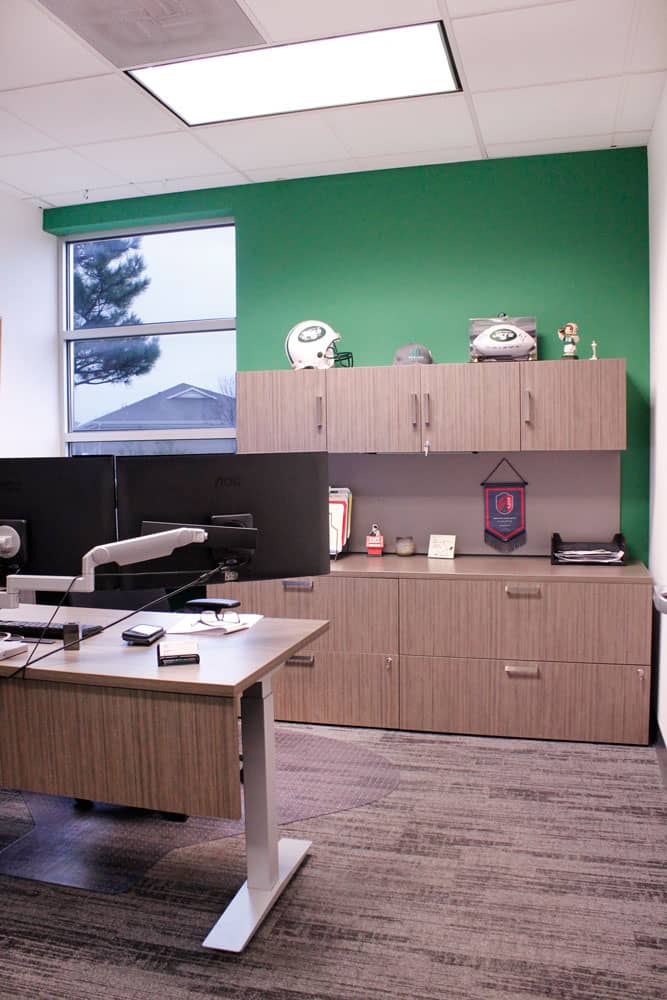
MC Freight, a growing St. Charles, MO-based cargo and freight company wanted their new space to be an attractive and enticing place for their employees to work. P•O•E worked with MC Freight to understand their workstyles and their goals for attracting new talent. Some of their work is very dynamic and requires a lot of collaboration while other teams require a more focused workspace. Additionally, the organization is actively growing and needs adequate space for new employees without feeling cramped. During their in-studio meeting, P•O•E’s designers presented the design in real-time, and after a tour of the studio and discussing everyone’s needs, were able to implement some very last-minute changes to the design. MC Freight is known for putting employee well-being first and it was important to them that every employee have a height-adjustable worksurface for multiple postures and movement throughout the day. P•O•E acted as the sole partner on this project, also providing paint and carpet throughout the entire workspace. MC Freight now has a fun and functional space to grow into the future.
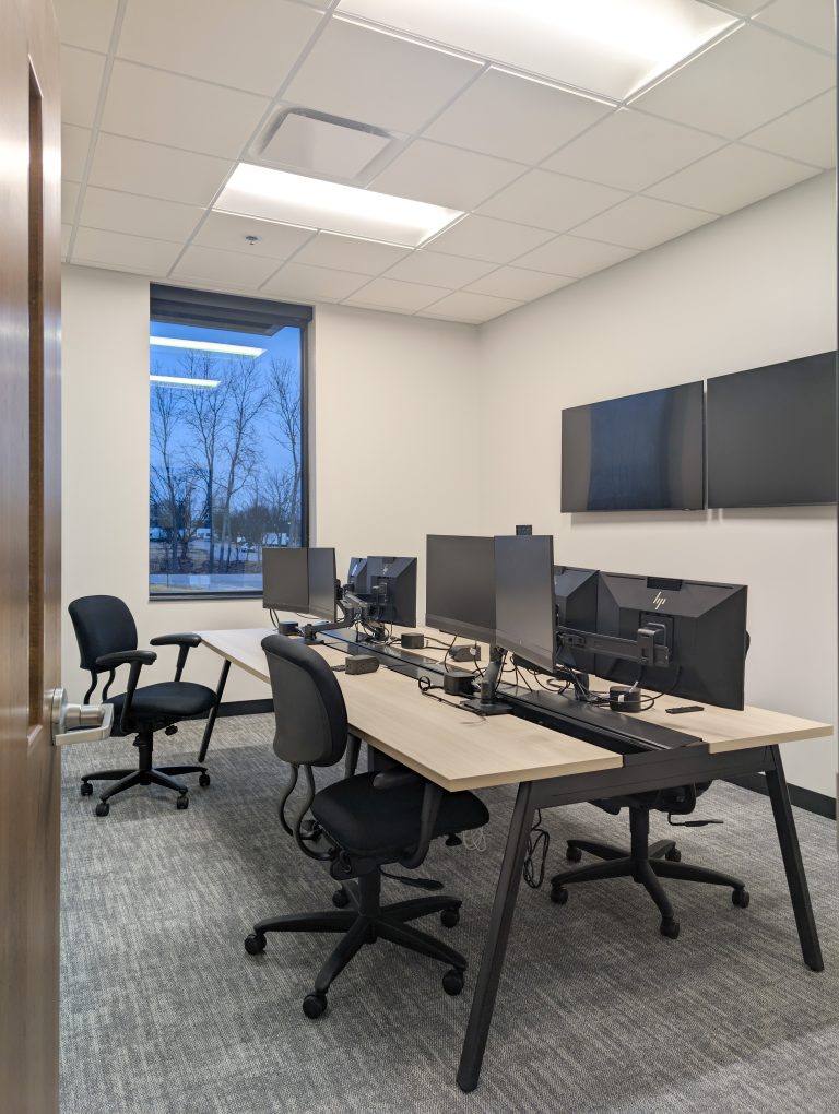
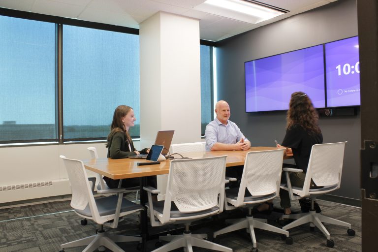
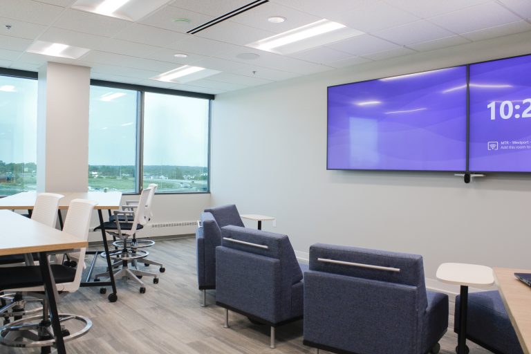
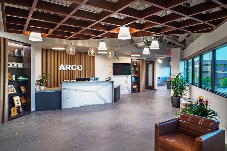
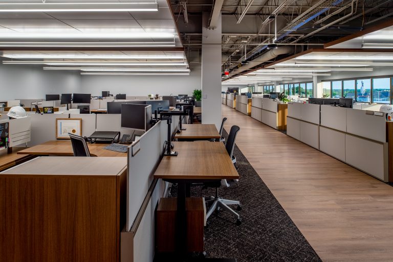
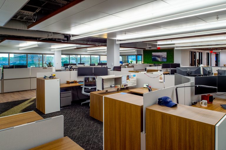
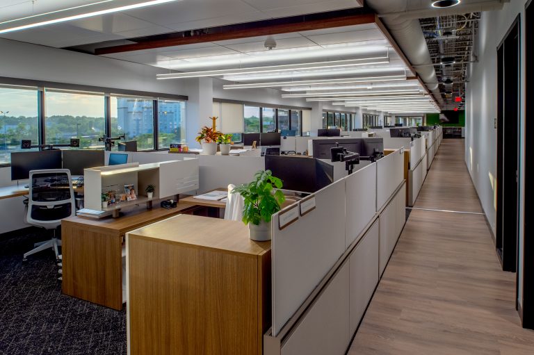
Our client, Post Holdings, based in St. Louis and best known for the delicious fruity Pebbles and Honey Bunches of Oats, relocated their Michael Foods Headquarters in Minnesota to a brand new 45,000 SF space. Employees gladly transitioned from 68” high panels and dark, heavy wood tones to a fresh, sophisticated space with other tenants that provide the employees with desired amenities. While a step into their space signage and selecting future finishes add those subtleties to their brand.
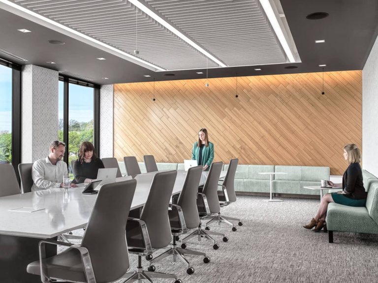
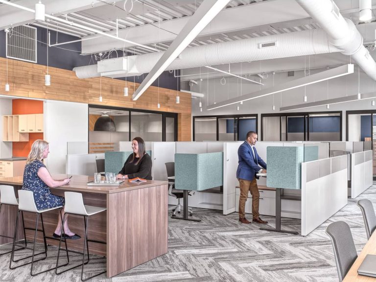
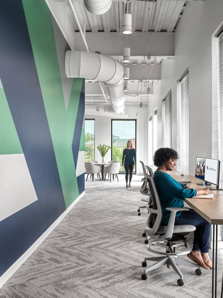
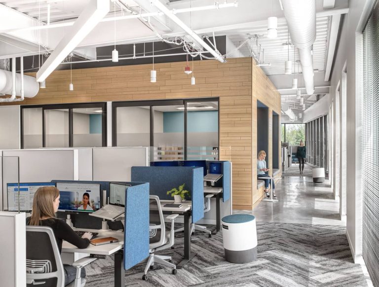
After a merger with another insurance group, Assured Partners needed to move to a new location that was designed to bring both cultures together in one cohesive space. The growth projections for both organizations are robust, so in addition to creating a brand aesthetic, the space needed to be flexible and agile. Lawrence Group partnered with POE for all of the seating that went into making this space a functional and attractive palace to work in.
Design Firm Credit: Lawrence Group
The Challenge
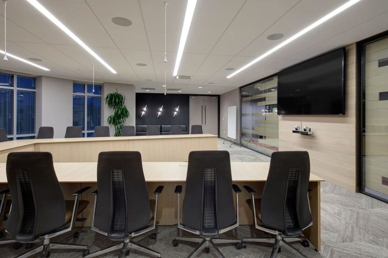
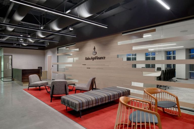
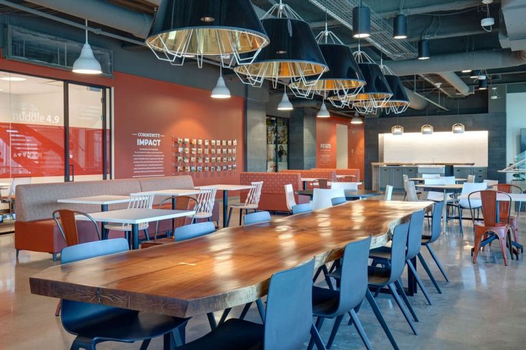
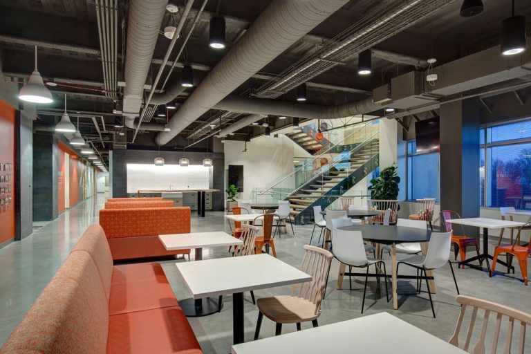
Rabo AgriFinance’s Traditional space was lacking social spaces for collaboration and lack of flexibility for growth. In Addition, their St. Louis headquarters did not reflect their Netherlands roots and culture.
The Solution
POE engaged John Scott from Haworth who then lead several Workplace strategy engagements with a select Rabo Evolve Team. The data from the Evolve team helped create several possible designs that would enable members to thrive. A pilot station was then built and feedback was accumulated from members within the program. Based on the feedback, small adjustments were made, but about 80% of the pilot was utilized toward the rest of the space. Today, Rabo AgrilFinance’s space reflects its culture and their heritage. By investing in Haworth’s Integrated Palette, they have also been able to easily flex and re-configure their space with zero downtime as they continue to grow.
Design Firm Credit: Gray Design Group
Workplace Strategy: Haworth
The Challenge
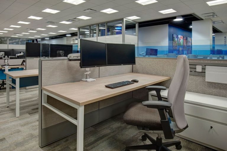
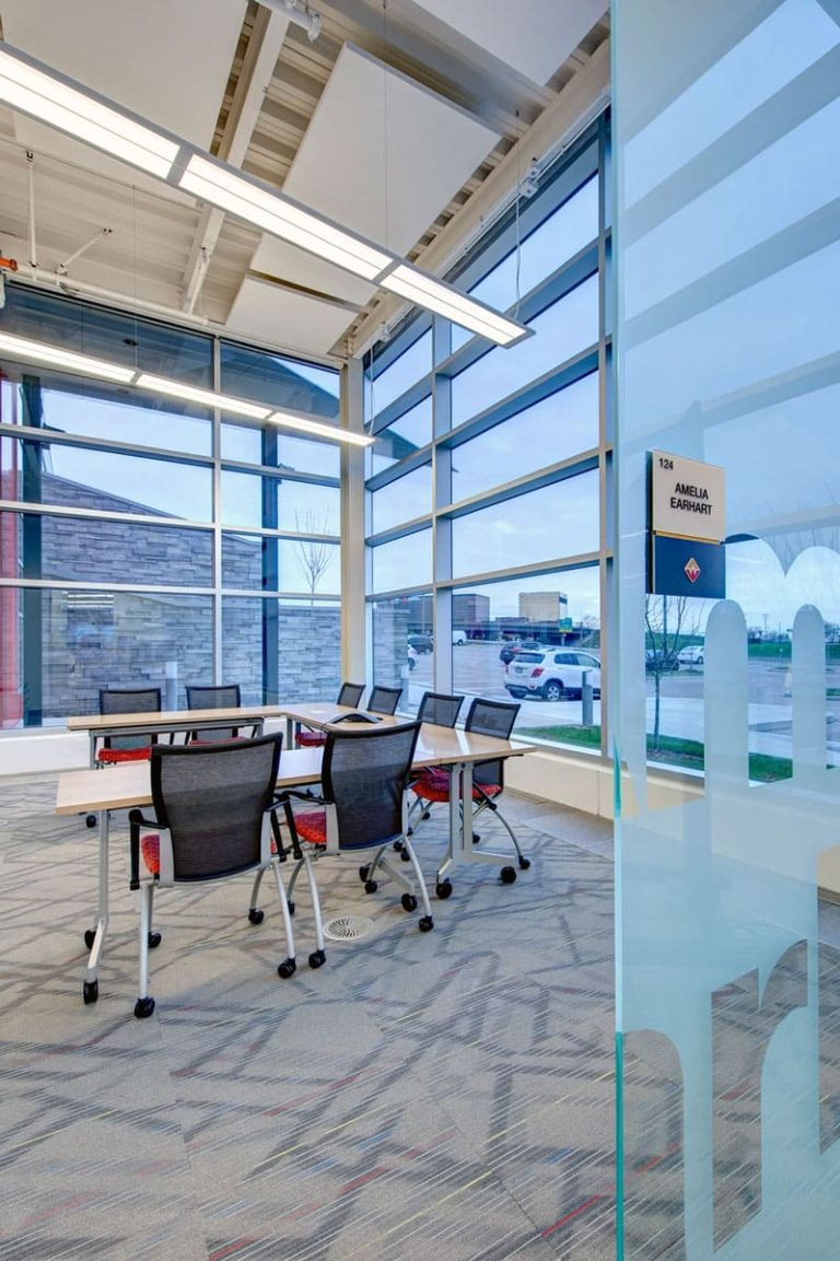
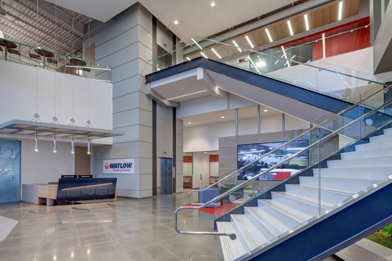
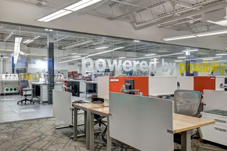
Watlow, a $500-million global innovator in the design and manufacturing of thermal systems, wanted to renovate the company;’s 50,000-square-foot global headquarters and create a state-of-the-art technological development facility that reflects its heritage and commitment to continued innovation.
The Solution
POE collaborated with Watlow members and design partners to create an open hub for collaboration and innovation. The open environment allows Watlow to also make use of several social spaces such as Loui’s Cafe which encourages personal connections nd fosters a sense of community.
Resources
Warlow Case Study
Case Study Video
Workplace Strategy Story
Design Firm Credit: Gray Design Group
Photographer: Jeff Wellman Photography
The Challenge
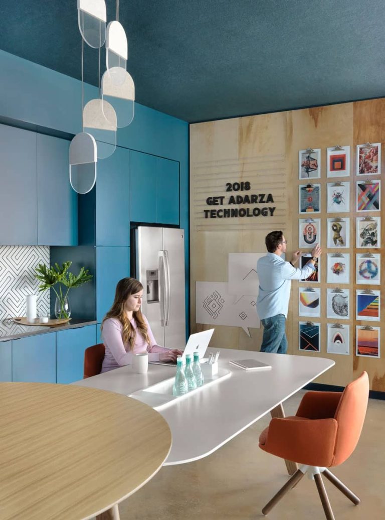
Adarza’s previous space was small and did not inspire creativity in order to innovate new biotech solutions. POE and architectural firm, Arcturis were selected to aid in the process.
The Solution
POE south to understand Adarza’s culture and learn their short and long-term goals for the organization. Based on that knowledge, POE collaborated with Adarza and Arcturis to creat a furniture solution that would enable innovation and collaboration.
Fun Fact In 2018, Adarza was nominated by St. Louis Business Journal as one of the “Coolest Office Spaces.”
Resources
Adarza BioSystems Case Study
Design Firm Credit: Arcturis
Photography: Alise O’Brian Photography
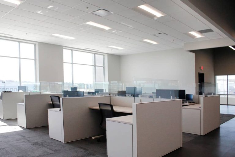
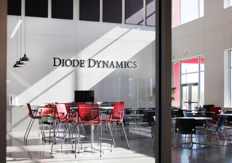
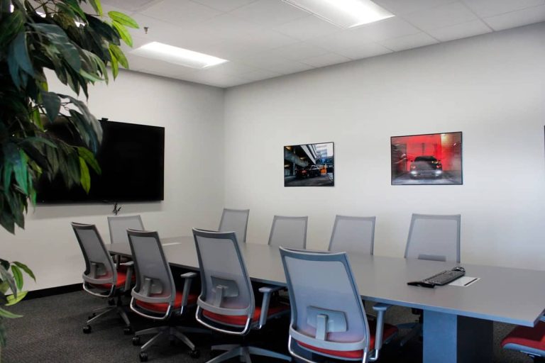
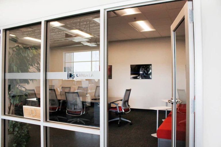
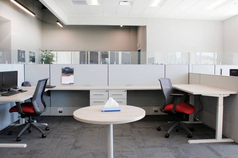
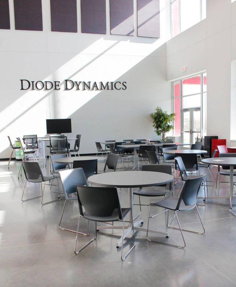
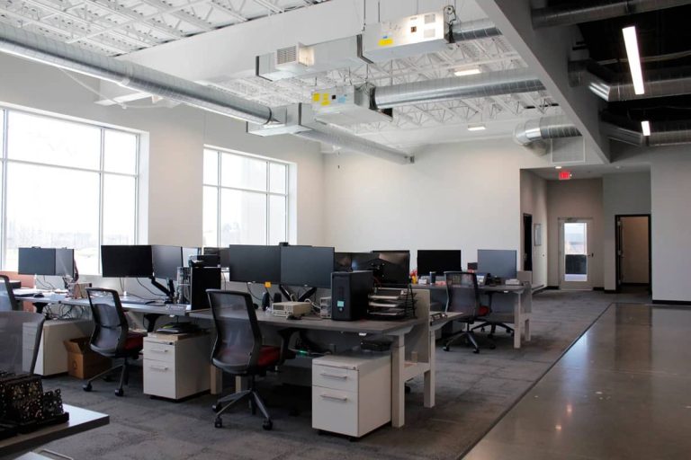
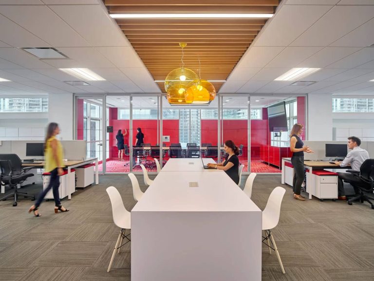
When designing the layout for Diode Dynamics’ brand new HQ building in St. Charles, Missouri, POE considered each department’s work style and job function in order to create space that would be supportive and efficient. The engineering department has a highly dynamic and collaborative space while the financial and human resources department has a higher partition for privacy and more storage. The marketing department is set up in a “cave to campfire” setting which provides flexibility between collaboration and focuses work while customer service is designed to make time on the phone as easy as possible with sound-absorbing panels and workstations having a common direction. All of these different applications were achieved by utilizing the same kit-of-parts from Haworth. Additionally, POE provided future planning and design for the intended growth of DIode Dynamics.
Design Firm Credit: Remiger Design
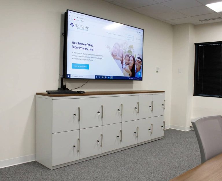
Plancorp knew that their employee and advisors felt confident working remotely and instead of mandating a return to the office, the leaders took the opportunity to rework their space so that it would draw people back organically. It is a highly functional space that wraps you up in visual interest with fun color and texture combinations. The bright and open floor plan is clean and fresh without feeling sterile and the furniture is design focused while maintaining a high level of comfort.
Design Firm Credit: Arcturis
Challenge
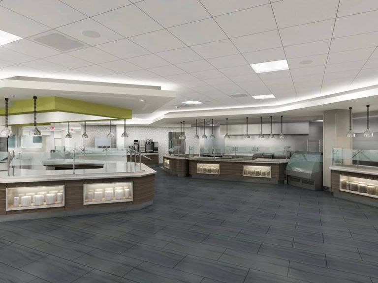
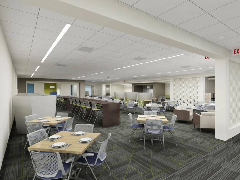
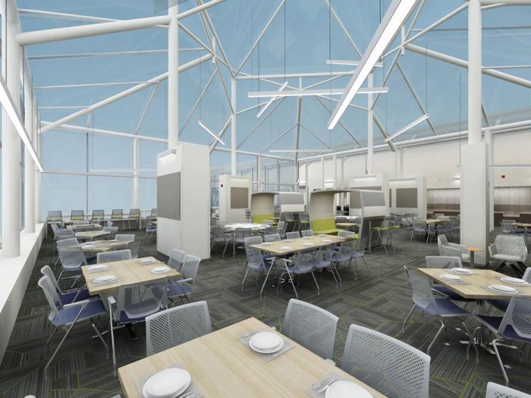
The client’s existing cafe was dark, outdated, and underutilized. The client was looking for ways to attract its members to use the space not only for lunch but for social collaboration throughout the day.
Solution
A 19,000-square-foot corporate cafeteria was created to help members relax and collaborate with peers. Different design elements were incorporated through the space such as lounge furniture and mobile working areas to help enable members to sleep away from their desks and work in other areas of the building seamlessly. Haworth, Berco, Arcadia, and Falcon were all used in the space.
Design Firm Credit: Verve Design Studio
Rendering: Verve Design Studio
The Challenge
This client was looking to develop a collaborative meeting area adjacent to the cafeteria. This was phase one of a multi-phase innovation project. The solution had to represent a refined approach to collaboration.
The Solution
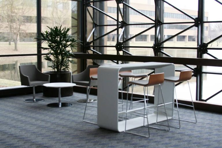
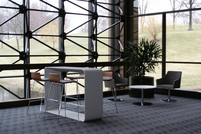
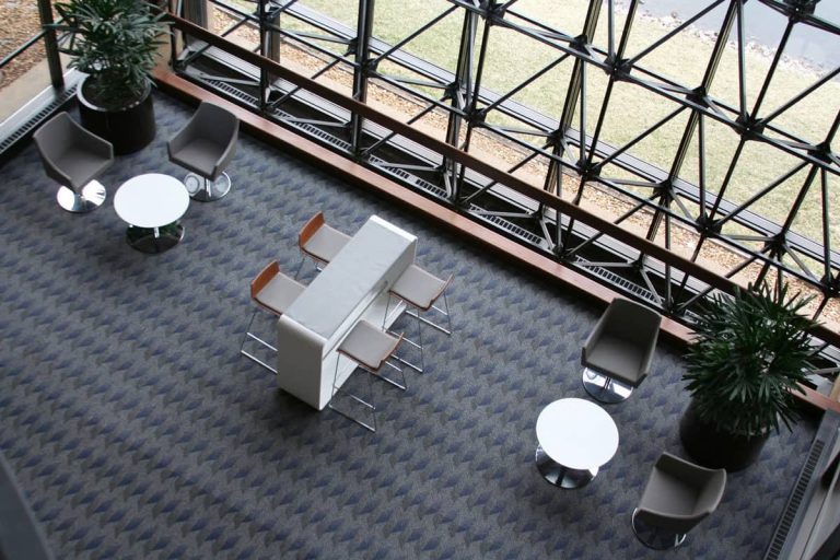
POE worked closely with the client’s design and facility management staff to elevate options. The final solution included Haworth Hop standing height tables to encourage impromptu collaboration. It is lightweight and easy to move if new groupings are desired. Aceray Alba polices off the setting.
Solution
A 19,000-square-foot corporate cafeteria was created to help members relax and collaborate with peers. Different design elements were incorporated through the space such as lounge furniture and mobile working areas to help enable members to sleep away from their desks and work in other areas of the building seamlessly. Haworth, Berco, Arcadia, and Falcon were all used in the space.
Design Firm Credit: Verve Design Studio
Rendering: Verve Design Studio
The Challenge
This large financial institution wanted to create and emphasize a cohesive internal and external facing brand for its space. Why wanted to be perceived as a forward-thinking tech influencer focusing on future innovations and attracting the best talent.
The Solution
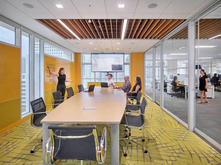
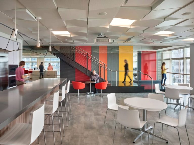
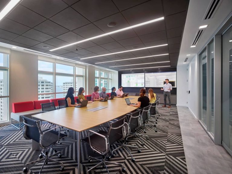
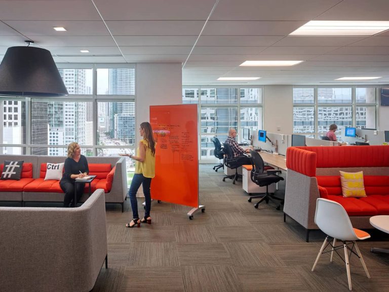
POE enjoyed working very closely with Gensler on their project. POE was the sole social space furniture provider. The scope of this project included 3 floors consisting of about 62,000 square feet of commercial space overlooking the Miami South Channel. Some of the social space manufacturers included Bernhardt, Nucraft, Ellemuir, Inscape, David, Gordon International, Arcadia, Aprer, Clarus, and BuzziSpace.
Design Firm Credit: Gensler
Photographer: Todd Mason
The Challenge
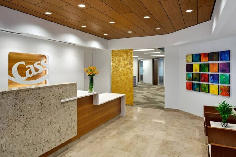
Cass Information had no investment in their workplace environment since the 1980’s. The furniture did not reflect the company’s technology-branded image.
The Solution
After a throughout evaluation and visits to the Chicago showroom, Cass selected POE to collaborate, develop, and implement the new furniture standard in St. Louis as well as several other locations across the United States.
Design Firm Credit: Remiger Design.
The Challenge
Gimmal was growing quickly and outgrowing their existing space. They were looking to find a new space and have that space represent their culture and people of benign forward innovators and high-tech.
The Solution
POE collaborated with Lawernce Group and provided Hop heigh adjustable benching, private offices, conference tables, cafe space with booths and bar area, meeting rooms, phone booths, and more. The space also provides wellness benefits and many members bring their bikes to work.
Design Frim Credit: Lawrence Group
Photography Credit: Alise O’Brien Photography
The Challenge
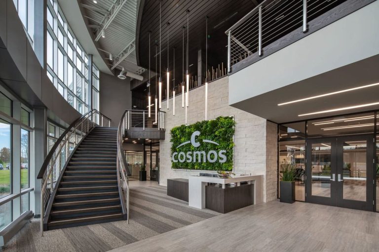
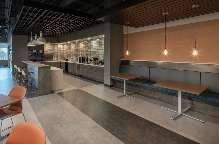
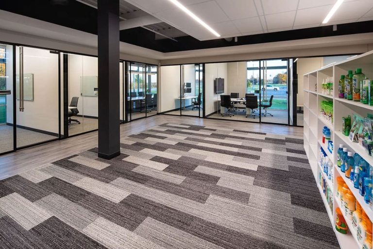
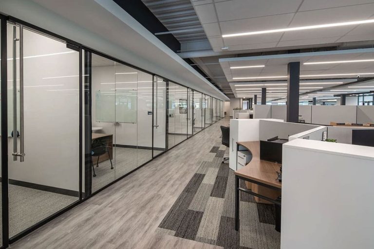
Cosmos needed to improve efficiencies, innovation, and workflow. Their current setup didn’t have any strategy behind it nor did it reflect their culture.
The Solution
After a throughout evaluation, personality, and cultural assessments, POE strategically laid out a floorplan that grouped employees together based on their role function, and department. This improved efficiencies, teamwork, and the speed of the product to market.
Design Firm Credit: O’Toole Design
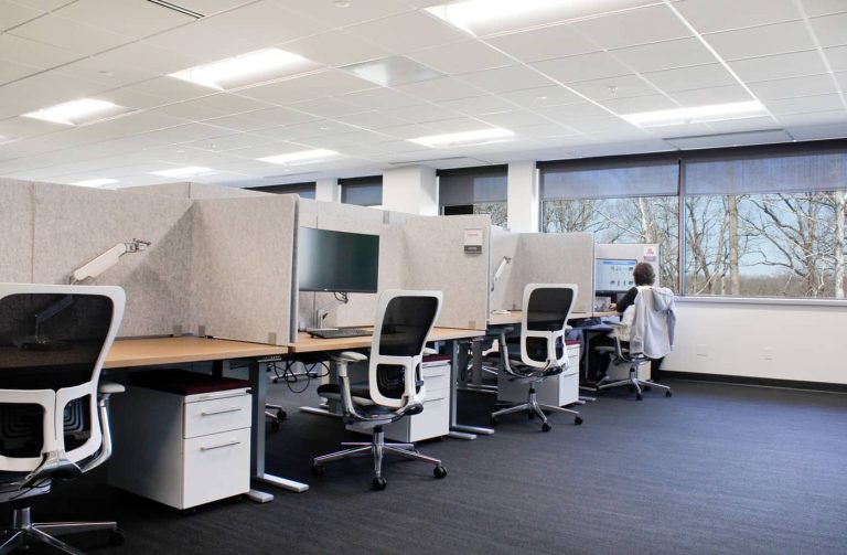
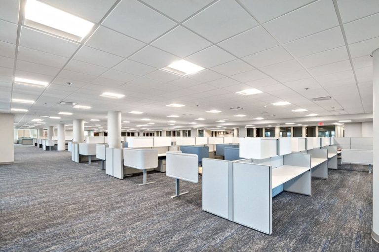
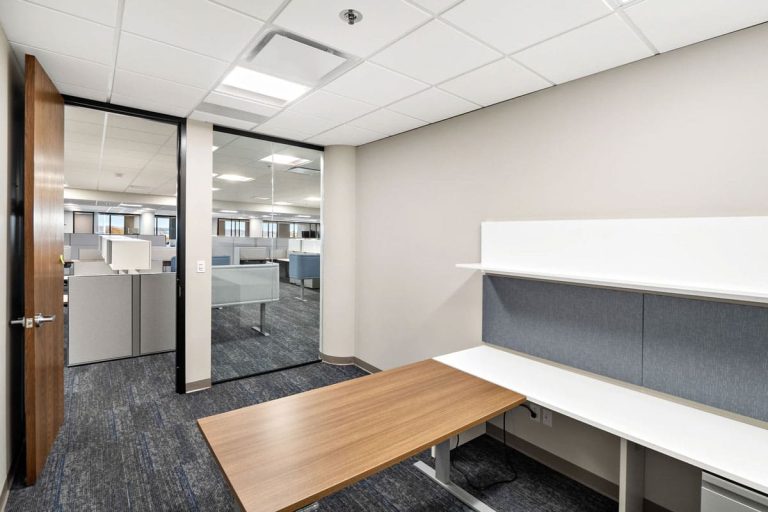
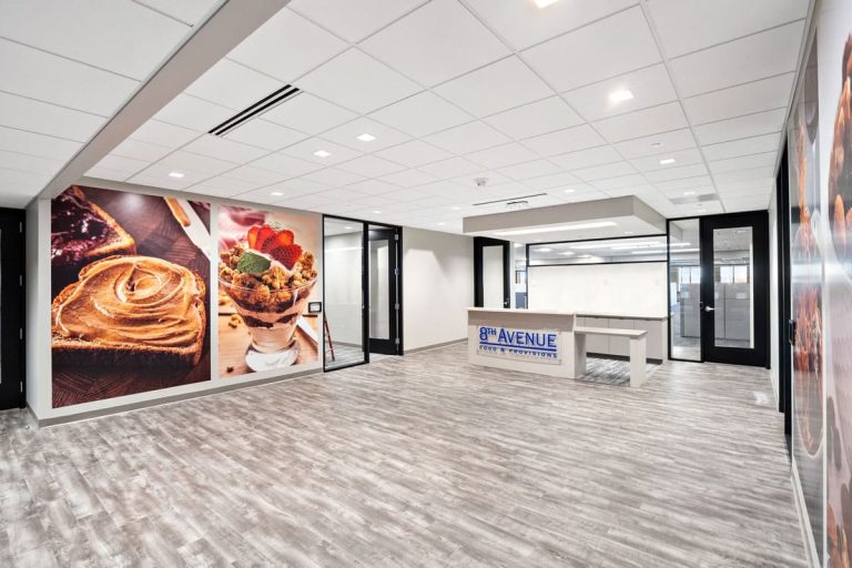
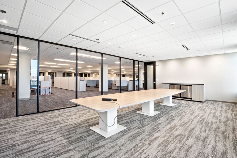
8th Avenue Foods is a division of Post Holdings and has partnered with POE for many years. When more space was needed for this division, they moved to Fenton, Missouri to a newly leased space. All work stations are Haworth with Humanscale adjustable height bases. Private offices, conference rooms, and ancillary spaces are Haworth.
St. Louis, MO | Higher Education
Product Used: Global Furniture Group Dess Lounge chairs, Princeton Tables, Height adjustable tables with Zira storage, Noetic Mesh back chairs, Sprintz flip seat nesting chairs, Flip top tables
St. Louis, MO
P·O·E was the furniture provider for the Sassafras Café in the Missouri Botanical Gardens. The Architecture & Design Firm was Tao + Lee Associates.
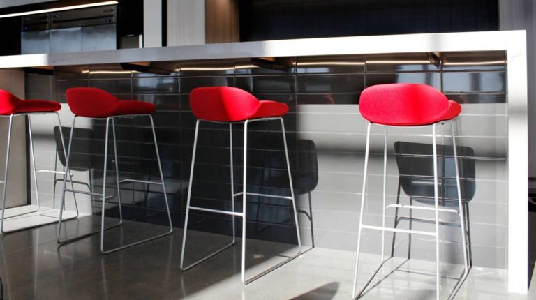
The Sandler Julia Dining Chairs and Stools were selected because of their durability, clean lines, and wood frame that brings warmth and a natural element to the indoor seating.
Bernhardt Monza Indoor/Outdoor Dining Chairs were selected because of their reasonable price and the color and durability of the teak wood with the contrast of the white plastic of the top rail that mimics the white of the table tops indoors and outdoors.
Haworth Cabana Island Sofa in the vestibule was selected because of the open nature of the two-sided sofa. It provides ample seating with a small footprint.
Haworth Poppy lounge and Guest Chairs were selected because of the shape and durability of the chairs. The Poppy is also available with many base options.
Janus Et Cie Outdoor Dining Tables were selected because of the known quality of the brand, as well as the offering of a knife edge.
Haworth Planes Dining Tables were selected because of the durability and warranty that Haworth offers.
The Challenge
The Brown School of Social Work implemented a fairly new concept for the collegiate workspace when it was completed several years ago. The Approach was an agile and highly flexible space that utilized raised access flooring and all demountable walls. The private offices were constructed at the core while workstations were placed on the perimeter. There are no built-ins in the private offices, so employees have autonomy over how their space is laid out.
The Solution
POE provided FF&E and 1200 linear feet of walls for the project while working closely and collaboratively with all other firms involved. This is a project that POE is very proud to have been a part of.
Design Firm Credit: Moore Ruble Yudell Architects & Players
Photography Credit: James Byard/Washington University
Challenge
Advanced ICU was moving spaces and wanted to relocate some of their existing private office furniture, but wanted to liquidate some of their other furniture and replace it with newer pieces. In addition, Advanced ICU needed a special monitoring space that would allow their doctors to monitor patients 24/7.
Solution
POE WDI team liquidated the furniture that was no longer needed. POE then collaborated with Advanced ICU and the Lawrence Group to provide new furniture to spaces such as cafes, open offices, and monitoring center.
Design Firm Credit: Lawrence Group
The VA Center in Columbia, MO moved into a new, larger space in order to better serve its veterans. Our GSA team worked to create a functional and calming space while making sure the employees had the space and storage they needed. P•O•E has worked with VA Centers all across the nation and we are proud to be a part of making great space for our heroes.
Please take a moment to fill out this survey.